Optimising Images and Media
Prepare and deliver web images efficiently by choosing suitable formats, resizing assets, comparing compression, using responsive images, and reserving dimensions.
Start Here
Images are often among the largest resources delivered by a website.
They are also one of the easiest places to make substantial performance improvements.
The solution is not: make every image tiny and blurry. The goal is: deliver enough image data for the visitor's actual needs.
- Where have you already seen optimising images and media in a real interface?
- Which part of this topic currently feels most important to test in a real page?
Prepare and deliver web images efficiently by choosing suitable formats, resizing assets, comparing compression, using responsive images, and reserving dimensions.
Learning Objectives
By the end of this lesson, you'll be able to:
- choose an appropriate image format
- resize an image for its intended display
- export a web-ready image
- compare compression
- use WebP and understand when AVIF may help
- use responsive image techniques
- reserve image dimensions
- lazy-load appropriate images
Why This Matters:
Prepare and deliver web images efficiently by choosing suitable formats, resizing assets, comparing compression, using responsive images, and reserving dimensions.
Raster and vector images
Raster images are built from pixels. Examples include JPEG, PNG, WebP, and AVIF. They are best suited to photographs and pixel-based artwork.
Vector images are built from shapes and mathematical paths. SVG is the primary vector format used in webpages. It is useful for logos, icons, diagrams, and illustrations.
Image format comparison
The following table uses an illustrative 1600 x 900 photographic image. The sizes are deliberately expressed as ranges because no honest table can promise that one format always creates the same result.
| Format | Compression | Transparency | Typical purpose | Illustrative 1600 x 900 photo |
|---|---|---|---|---|
| PNG | Lossless | Yes | Graphics, screenshots, transparency | ~1-4 MB |
| JPEG | Lossy | No | Photographs | ~200-600 KB |
| WebP | Lossy/lossless | Yes | General web photography and graphics | ~120-400 KB |
| AVIF | Lossy/lossless | Yes | Highly compressed modern web imagery | ~80-300 KB |
| SVG | Vector | Yes | Logos, icons, diagrams | Often ~1-100 KB |
These are teaching examples, not file-size promises. Students must measure their own assets.
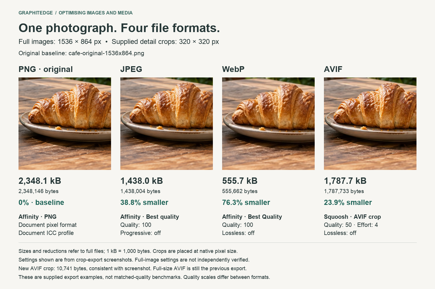
These supplied exports are examples, not a matched-quality benchmark. Full-image export settings were not independently verified, and the AVIF detail crop uses a different export from the full-size AVIF.
Choosing a format
A useful starting point:
- Photograph: consider WebP or AVIF, with JPEG where required by the workflow.
- Graphic requiring transparency: consider WebP or PNG depending on requirements.
- Logo or icon: prefer SVG when the artwork is truly vector.
- Screenshot: PNG may remain appropriate when lossless detail matters, although modern formats should also be tested.
The correct answer is: test the image. Not: always use format X.
Tool workflow
Affinity can be used as the professional image-preparation tool for cropping, resizing, and exporting source assets. The current Affinity product is presented by Affinity as a free professional photo, design, and layout application, but export support and interface details should be checked before screenshot instructions are finalised.
Squoosh is useful for learning because it lets students compare compression visually. It complements Affinity rather than replacing it, especially when comparing JPEG, WebP, and AVIF.
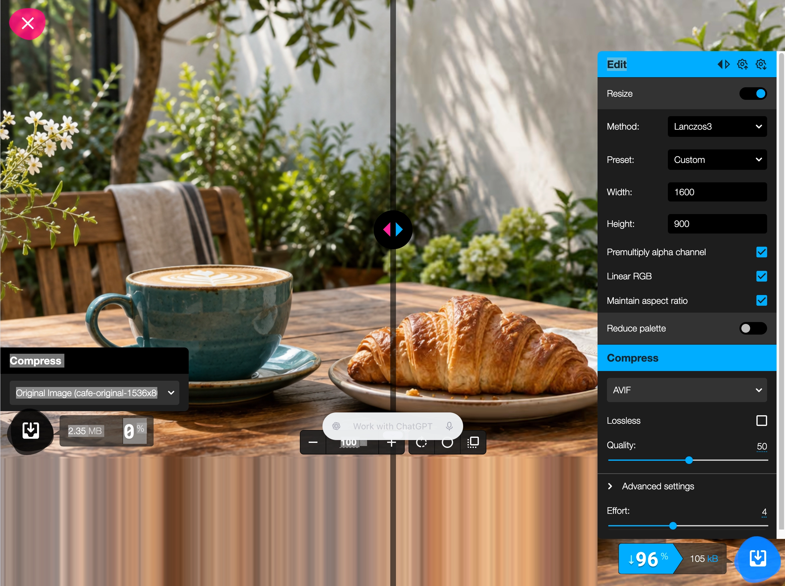
This separate Squoosh run shows a 1600 x 900 resize and AVIF quality 50. Its displayed saving applies to that run, not the full-size AVIF in the comparison above.
Screenshot placeholders: Add
affinity-crop-workflow.webp,affinity-resize-workflow.webp, andaffinity-webp-export.webpfrom the real current interface. Do not use one enormous screenshot.
Responsive images
Responsive images let the browser choose an appropriate resource.
<img
  src="bistro-800.webp"
  srcset="
    bistro-480.webp 480w,
    bistro-800.webp 800w,
    bistro-1600.webp 1600w
  "
  sizes="100vw"
  width="1600"
  height="900"
  alt="Dining room at Black Swan Bistro"
>Lazy loading and dimensions
Off-screen images may use lazy loading:
<img
  src="gallery.webp"
  loading="lazy"
  width="800"
  height="600"
  alt="..."
>
Do not automatically lazy-load the primary image responsible for the initial visible experience.
Always consider width and height. These dimensions help the browser reserve the correct aspect ratio before the image arrives, which helps reduce layout shift.
Check Your Understanding
Before moving forward, can you answer these?
- 1. Why are image-size examples shown as ranges?
- 2. When is SVG usually appropriate?
- 3. Why should the main above-the-fold image not automatically be lazy-loaded?
Check Your Answers
- Because file size depends on dimensions, detail, quality, encoder, transparency, and export settings.
- For genuinely vector artwork such as logos, icons, diagrams, and illustrations.
- Because delaying a primary visible image can make the initial experience worse.
How confident are you with this concept?
Still confused | Getting there | Got it | Could explain it to a friend
Guided Practice
Prepare a photograph for a hero area requiring approximately 1600 x 900 pixels.
Step 1 - Keep the original
Place the original in assets/source/ and never overwrite it.
Step 2 - Crop and resize
Crop to a 16:9 composition, then resize to approximately 1600 x 900 pixels. Do not enlarge a small source image merely to meet an arbitrary number.
Step 3 - Export and compare
Export a WebP version to assets/web/. Record original size, final size, saving, and visible quality observations.
Step 4 - Compare compression
Use Squoosh to compare JPEG, WebP, and AVIF. Zoom into areas with texture, gradients, or fine detail.
Independent Practice
Optimise three images: one photograph, one screenshot or graphic, and one logo or icon.
Your Task:
Optimise three images: one photograph, one screenshot or graphic, and one logo or icon.
Requirements:
- choose and justify the format for each asset
- record original dimensions and size
- record final dimensions and size
- calculate percentage saving
- inspect the finished webpage in DevTools
Success Criteria:
| Criteria | You've succeeded if... |
|---|---|
| each image choice is justified by purpose | Completed clearly and correctly in your solution. |
| quality is checked visually | Completed clearly and correctly in your solution. |
| dimensions are reserved in HTML | Completed clearly and correctly in your solution. |
| below-the-fold images use lazy loading where appropriate | Completed clearly and correctly in your solution. |
Before you continue
- I can distinguish raster and vector images.
- I can resize an image for the web.
- I can export WebP where my tool supports it.
- I can compare WebP and AVIF.
- I understand responsive images.
- I know why image dimensions matter.
- I know when lazy loading is useful.
- I measured my own file savings.
Extension activity
Take the same photograph and produce JPEG, WebP, and AVIF versions. Hide the filenames and ask another person whether they can identify visible differences at normal webpage size. Compare that observation with the file sizes.
Closure
Key Takeaways:
- Optimising an image involves more than pressing Compress.
- A professional workflow asks what the image is, how large it must appear, which format suits it, what quality is acceptable, which device receives it, and when it needs to load.
- The best image is the smallest appropriate file that still does its job well.
Learning Objectives Review:
Look back at what you set out to learn. Can you now:
- choose an appropriate image format Check!
- resize an image for its intended display Got it!
- export a web-ready image Can explain it!
- compare compression Could teach this!
- use WebP and understand when AVIF may help Check!
- use responsive image techniques Got it!
- reserve image dimensions Can explain it!
- lazy-load appropriate images Could teach this!
If you can confidently answer "yes" to most of these, you're ready to move on!
Think & Reflect:
Pause and reflect
- Which idea from this lesson now feels practical rather than abstract?
- What would you build or test next to make this stick?
Looking Ahead:
- Optimising an image involves more than pressing Compress.
- A professional workflow asks what the image is, how large it must appear, which format suits it, what quality is acceptable, which device receives it, and when it needs to load.
- The best image is the smallest appropriate file that still does its job well.
Recommended Next Steps
Continue Learning
Ready to move forward? Continue with the next tutorial in this series:
CSS and Web Font PerformanceRelated Topics
Explore these related tutorials to expand your knowledge:
Additional Resources
Deepen your understanding with these helpful resources:
- Affinity - Prepare, resize, crop, and export source image assets.
- Squoosh - Compare image formats, compression settings, quality, and file size.
- web.dev: Image performance - Practical guidance on efficient image loading and delivery.
- MDN: Image file type and format guide - Compare common web image formats and their appropriate uses.
- MDN: Responsive images - Learn how srcset and sizes help browsers choose suitable image files.