Black Swan Bistro (BSB) Part 2
Build the Homepage Wireframe Layout with CSS
From Structure to Layout
In Part 1, you built the homepage structure with semantic HTML. That gave the page a clear skeleton, but it probably still looked like one long stack of plain content.
That is completely normal. HTML gives the page meaning. CSS helps you organise that meaning into a layout people can scan, follow, and understand.
In this part, you are not chasing a polished restaurant website yet. You are building a calm, low-fidelity wireframe so you can clearly see how repeated layout patterns make a page feel organised.
- What changed when you wrote the HTML in Part 1, even before any styling existed?
- Which parts of a homepage usually repeat the same spacing or card style?
- Why might it be useful to keep the design simple while you learn layout?
This lesson focuses on layout first. You will use plain HTML and CSS to build a homepage wireframe, create reusable styling patterns, and prepare the site for the component refactor in Part 3.
Learning Objectives
By the end of this lesson, you'll be able to:
- Turn semantic homepage HTML into a low-fidelity wireframe layout with CSS
- Create Create a small logo-inspired colour system with CSS custom properties in :root
- Use reusable classes such as .container, .section, .section-title, .button, .card, and .card-grid
- Style the header, hero, gallery, menu preview, and footer with simple repeatable patterns
- Understand Understand the difference between visual reuse with CSS classes and structural reuse with components
Why This Matters:
Beginners often try to style every section as if it is a brand-new problem. This lesson shows a better habit: define a few strong patterns, then reuse them across the page so the layout feels consistent and easier to maintain.
Before You Start:
You should be familiar with:
- Breaking Layouts into Sections Review here
- Box Model Review here
- Layout Fundamentals Review here
Project Brief
This tutorial series uses a real client brief as its source material. Before you write any code, download and read the Black Swan Bistro client brief. It describes the restaurant, its audience, and the pages the site needs to include. You will refer back to this brief throughout Parts 2, 3, and 4.
Structure first, content later. Your job in this part is to build the layout skeleton. Use the brief to understand what sections the site needs, but do not worry about matching the final copy, images, or colours yet. Keep the page in wireframe mode and focus on spacing, hierarchy, and repeatable patterns.
Tutorial Introduction
In this lesson, you will take the homepage from Part 1 and turn it into a wireframe-style layout using plain CSS. The goal is not to make the site look finished yet. The goal is to make the structure easier to read, easier to scan, and easier to build on.
As you work, pay attention to repeated patterns. You will use the same spacing, card shapes, and button styles across several sections. That is an important step toward maintainable CSS, and it sets up the refactor you will do in Part 3.
Project Brief & Wireframes
Before writing CSS, review the Black Swan Bistro project brief so your layout work comes from the client goals, the content pack, and the wireframe structure rather than from guesswork.
Use the wireframes to guide your layout decisions. They show the order of sections, the repeated shells, and the parts of the page that should stay consistent as the project grows.
Required project step: students should review the Black Swan Bistro Project Brief before styling the homepage. The brief makes the wireframes active project guidance, not optional extra reading.
What You Will Build
You will build a low-fidelity homepage wireframe for Black Swan Bistro with these sections:
- Header with logo and navigation
- Hero section with a short introduction and call to action
- Featured dishes area using repeated cards
- About the bistro section
- Menu preview section
- Simple gallery grid
- Booking call to action
- Location and opening hours
- Footer
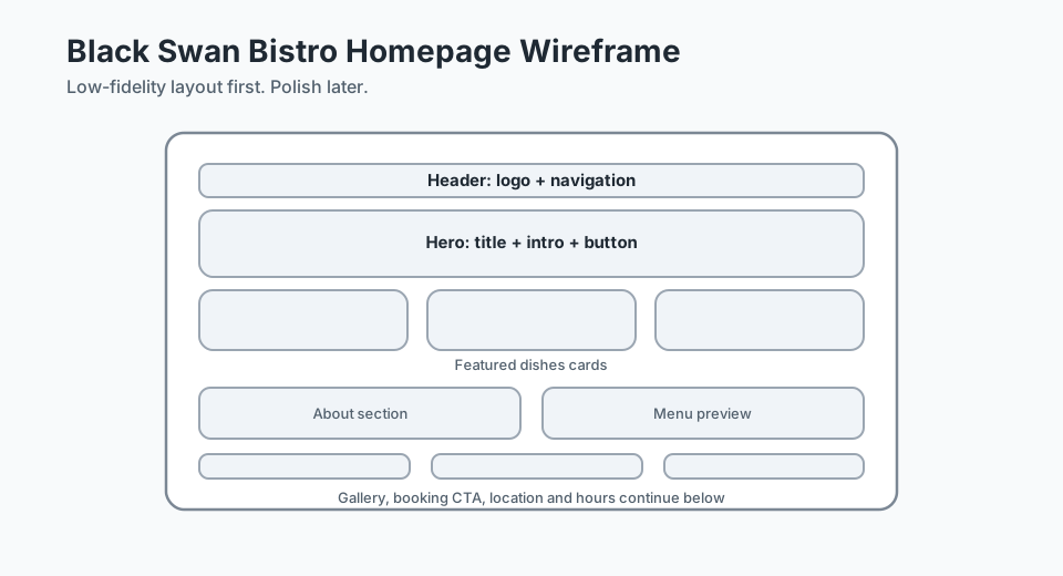
Keep the page in wireframe mode: simple blocks, clear spacing, and repeatable patterns matter more than polished copy, fancy images, or advanced effects.
What You Will Learn
- How a
.containerkeeps content at a comfortable page width - Why shared
.sectionspacing makes long pages easier to follow - How a reusable
.section-titlecreates visual consistency - How one
.buttonclass can be reused across the homepage - Why
.cardand.card-gridare useful before you build components - How CSS custom properties help you manage colours from one place
Low-Fidelity Text Wireframe
Before you write CSS, it helps to picture the page as a stack of clear layout blocks. This wireframe is intentionally simple:
[ Header ]
[ Logo ] [ Navigation links ..................................... ]

[ Hero ]
[ Headline ..................................................... ]
[ Short intro text ............................................. ]
[ Button ]

[ Featured Dishes ]
[ Card ] [ Card ] [ Card ]

[ About the Bistro ]
[ Short text block ............................................. ]

[ Menu Preview ]
[ Card ] [ Card ] [ Card ]

[ Gallery ]
[ Image ] [ Image ] [ Image ] [ Image ]

[ Booking CTA ]
[ Short text ................................ ] [ Button ]

[ Location and Opening Hours ]
[ Address / map placeholder ] [ Hours list ]

[ Footer ]
[ Small site links and copyright ]
This is the main idea of the lesson: the homepage is not a random pile of different styles. It is a group of sections that can share layout rules.
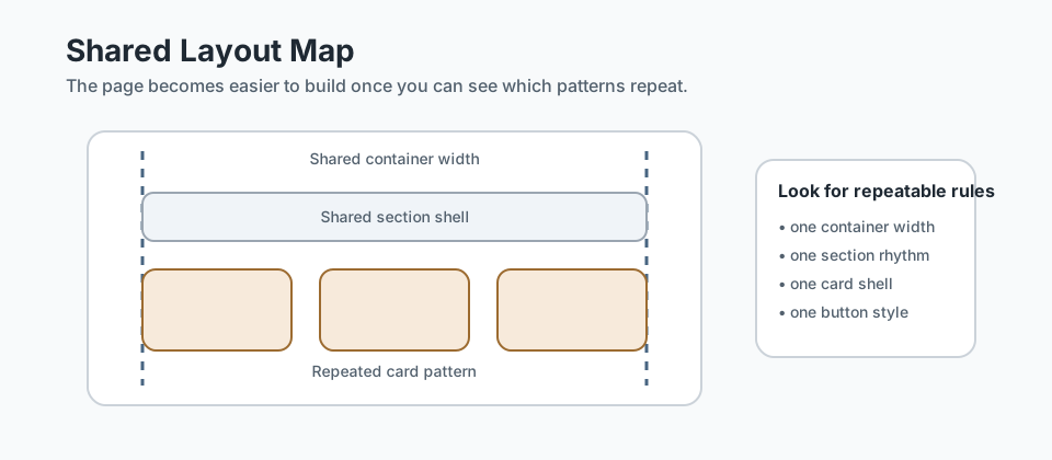
Beginner-Friendly Homepage HTML Starter Code
If you finished Part 1, you already have most of this structure. This version adds simple reusable classes so the CSS can style repeated patterns more easily.
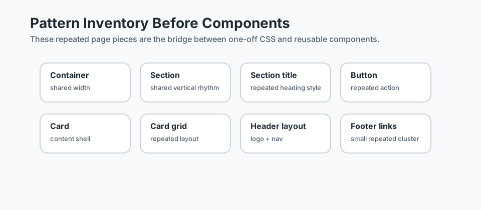
<!DOCTYPE html>
<html lang="en">
<head>
<meta charset="UTF-8">
<meta name="viewport" content="width=device-width, initial-scale=1.0">
<title>Black Swan Bistro | Homepage Wireframe</title>
<link rel="stylesheet" href="css/style.css">
</head>
<body>
<!-- Site header -->
<header class="site-header">
<div class="container header-layout">
<a href="#" class="logo">Black Swan Bistro</a>
<nav class="site-nav" aria-label="Main navigation">
<ul class="nav-list">
<li><a href="#hero">Home</a></li>
<li><a href="#featured-dishes">Dishes</a></li>
<li><a href="#menu-preview">Menu</a></li>
<li><a href="#location-hours">Visit</a></li>
</ul>
</nav>
</div>
</header>
<main>
<!-- Hero section -->
<section id="hero" class="section hero">
<div class="container">
<p class="eyebrow">Under construction</p>
<h1>A calm riverside bistro homepage, built step by step</h1>
<p>
We are still drafting the final content, but this homepage wireframe
shows how the Black Swan Bistro site will be organised.
</p>
<a href="#menu-preview" class="button">View the layout</a>
</div>
</section>
<!-- Featured dishes -->
<section id="featured-dishes" class="section">
<div class="container">
<h2 class="section-title">Featured Dishes</h2>
<div class="card-grid">
<article class="card">
<h3>Barramundi</h3>
<p>Simple placeholder text for a featured dish card.</p>
</article>
<article class="card">
<h3>Pumpkin Soup</h3>
<p>Simple placeholder text for a featured dish card.</p>
</article>
<article class="card">
<h3>Pavlova</h3>
<p>Simple placeholder text for a featured dish card.</p>
</article>
</div>
</div>
</section>
<!-- About section -->
<section id="about" class="section">
<div class="container card">
<h2 class="section-title">About the Bistro</h2>
<p>
Black Swan Bistro is a fictional restaurant project. Right now, our goal
is to organise the homepage layout before we worry about polished copy.
</p>
</div>
</section>
<!-- Menu preview -->
<section id="menu-preview" class="section">
<div class="container">
<h2 class="section-title">Menu Preview</h2>
<div class="card-grid">
<article class="card">
<h3>Starters</h3>
<p>A short summary of what belongs in this menu group.</p>
</article>
<article class="card">
<h3>Mains</h3>
<p>A short summary of what belongs in this menu group.</p>
</article>
<article class="card">
<h3>Desserts</h3>
<p>A short summary of what belongs in this menu group.</p>
</article>
</div>
</div>
</section>
<!-- Gallery section -->
<section id="gallery" class="section">
<div class="container">
<h2 class="section-title">Gallery</h2>
<div class="gallery-grid">
<img src="images/gallery-1.jpg" alt="Placeholder dish image">
<img src="images/gallery-2.jpg" alt="Placeholder dining room image">
<img src="images/gallery-3.jpg" alt="Placeholder bistro exterior image">
<img src="images/gallery-4.jpg" alt="Placeholder table setting image">
</div>
</div>
</section>
<!-- Booking call to action -->
<section id="booking" class="section">
<div class="container booking-layout card">
<div>
<h2 class="section-title">Book a Table</h2>
<p>This is a simple call to action area for future booking content.</p>
</div>
<a href="#" class="button">Booking Coming Soon</a>
</div>
</section>
<!-- Location and hours -->
<section id="location-hours" class="section">
<div class="container info-grid">
<section class="card">
<h2 class="section-title">Location</h2>
<p>Elizabeth Quay, Perth</p>
<p>Map placeholder for now</p>
</section>
<section class="card">
<h2 class="section-title">Opening Hours</h2>
<ul>
<li>Tuesday to Thursday: 5pm - 9pm</li>
<li>Friday to Saturday: 5pm - 10pm</li>
<li>Sunday: 5pm - 8pm</li>
</ul>
</section>
</div>
</section>
</main>
<!-- Site footer -->
<footer class="site-footer">
<div class="container footer-layout">
<p>© 2026 Black Swan Bistro</p>
<nav aria-label="Footer navigation">
<ul class="footer-links">
<li><a href="#hero">Top</a></li>
<li><a href="#menu-preview">Menu</a></li>
<li><a href="#location-hours">Visit</a></li>
</ul>
</nav>
</div>
</footer>
</body>
</html>Matching CSS Starter Code
This stylesheet keeps the design modest. It gives the page structure, spacing, and repeated patterns without turning it into a finished brand site yet.
/* ---------------------------------- */
/* Base styles and colour system    */
/* ---------------------------------- */

:root {
    --color-black: #161312;
    --color-burnt-red: #7b2d26;
    --color-golden-orange: #c98b2e;
    --color-cream: #f5eee3;
    --color-text: #2e2724;
    --color-border: #d9c8b4;
    --color-surface: #fffaf4;
    --color-white: #ffffff;
}

/* Keep sizing predictable */
*,
*::before,
*::after {
    box-sizing: border-box;
}

body,
h1,
h2,
h3,
p,
ul {
    margin: 0;
}

body {
    font-family: Arial, sans-serif;
    line-height: 1.6;
    background-color: var(--color-cream);
    color: var(--color-text);
}

ul {
    padding-left: 1.25rem;
}

a {
    color: var(--color-burnt-red);
    text-decoration: none;
}

a:hover,
a:focus {
    color: var(--color-golden-orange);
}

img {
    display: block;
    width: 100%;
    height: auto;
    border: 2px solid var(--color-border);
    background-color: var(--color-white);
}

/* ---------------------------------- */
/* Reusable layout patterns           */
/* ---------------------------------- */

.container {
    width: min(1100px, 92%);
    margin: 0 auto;
}

.section {
    padding: 3rem 0;
}

.section-title {
    margin-bottom: 1rem;
    font-size: 1.75rem;
    color: var(--color-black);
}

.button {
    display: inline-block;
    padding: 0.85rem 1.25rem;
    border: 2px solid var(--color-burnt-red);
    background-color: var(--color-burnt-red);
    color: var(--color-white);
    font-weight: 700;
}

.button:hover,
.button:focus {
    background-color: var(--color-golden-orange);
    border-color: var(--color-golden-orange);
    color: var(--color-black);
}

.card {
    padding: 1.5rem;
    border: 2px solid var(--color-border);
    background-color: var(--color-surface);
}

.card-grid {
    display: grid;
    grid-template-columns: repeat(auto-fit, minmax(220px, 1fr));
    gap: 1rem;
}

/* ---------------------------------- */
/* Header and navigation              */
/* ---------------------------------- */

.site-header {
    padding: 1rem 0;
    border-bottom: 3px solid var(--color-burnt-red);
    background-color: var(--color-surface);
}

.header-layout {
    display: flex;
    justify-content: space-between;
    align-items: center;
    gap: 1rem;
    flex-wrap: wrap;
}

.logo {
    font-size: 1.25rem;
    font-weight: 700;
    color: var(--color-black);
}

.nav-list,
.footer-links {
    list-style: none;
    display: flex;
    gap: 1rem;
    padding: 0;
}

/* ---------------------------------- */
/* Hero section                       */
/* ---------------------------------- */

.hero {
    background-color: var(--color-surface);
}

.hero .container {
    padding: 2rem;
    border: 2px dashed var(--color-burnt-red);
}

.eyebrow {
    margin-bottom: 0.75rem;
    text-transform: uppercase;
    letter-spacing: 0.08em;
    font-size: 0.875rem;
    color: var(--color-burnt-red);
}

.hero h1 {
    margin-bottom: 1rem;
    font-size: 2.25rem;
}

.hero p {
    max-width: 60ch;
    margin-bottom: 1rem;
}

/* ---------------------------------- */
/* Menu preview, booking, and info    */
/* ---------------------------------- */

.booking-layout,
.info-grid {
    display: grid;
    gap: 1rem;
}

.booking-layout {
    grid-template-columns: repeat(auto-fit, minmax(240px, 1fr));
    align-items: center;
}

.info-grid {
    grid-template-columns: repeat(auto-fit, minmax(260px, 1fr));
}

/* ---------------------------------- */
/* Gallery                            */
/* ---------------------------------- */

.gallery-grid {
    display: grid;
    grid-template-columns: repeat(auto-fit, minmax(180px, 1fr));
    gap: 1rem;
}

.gallery-grid img {
    min-height: 180px;
    object-fit: cover;
}

/* ---------------------------------- */
/* Footer                             */
/* ---------------------------------- */

.site-footer {
    padding: 1.5rem 0;
    background-color: var(--color-black);
    color: var(--color-cream);
}

.footer-layout {
    display: flex;
    justify-content: space-between;
    align-items: center;
    gap: 1rem;
    flex-wrap: wrap;
}

.site-footer a {
    color: var(--color-cream);
}

/* ---------------------------------- */
/* Small-screen tidy-up               */
/* ---------------------------------- */

@media (max-width: 700px) {
    .hero h1 {
        font-size: 1.8rem;
    }

    .nav-list,
    .footer-links {
        flex-direction: column;
        gap: 0.5rem;
    }
}
Step-by-Step: The Main CSS Patterns
1. The .container Pattern
The .container class stops your content from stretching all the way across the screen. Very wide lines are tiring to read, so it is helpful to create one reusable width rule and use it in every major section.
Instead of setting a different width on the hero, the gallery, the footer, and the menu preview, you set the rule once and reuse it everywhere.
2. The .section Spacing Pattern
Long pages need breathing room. The .section class adds top and bottom padding so each homepage block feels separate without needing custom spacing rules for every section.
This is one of the clearest examples of repeatable CSS thinking: one class, many sections, consistent results.
3. The .section-title Pattern
Section headings should look related. By using the same .section-title class on Featured Dishes, About the Bistro, Menu Preview, Gallery, and other sections, you make the page easier to scan.
This also makes future changes easier. If you want all section titles to become larger later, you only update one rule.
4. The .button Pattern
Buttons are another good place to practise reuse. A homepage often has more than one call to action. Instead of writing separate styles for each link, you create a single .button class and apply it where needed.
That helps students see an important idea early: CSS classes can create consistency even before you move to reusable components.
5. The .card and .card-grid Pattern
The featured dishes and menu preview sections both use repeated content blocks. The individual block is a .card. The layout that arranges those blocks is the .card-grid.
This is the bridge into Part 3. Right now, the repeated structure still lives directly in the HTML. In the next part, you will notice that repetition and refactor it into reusable components.
6. The Header Layout Pattern
The header needs two jobs to happen at once: show the logo and line up the navigation. A simple layout class such as .header-layout keeps that relationship tidy without forcing you to style the header from scratch every time.
Using a shared layout class also makes the structure easier to understand when you read the HTML back later.
7. The Footer Layout Pattern
The footer follows the same thinking as the header: it is another area with small pieces that need to sit together in a predictable way. A simple .footer-layout class keeps the bottom of the page organised and helps the whole homepage feel consistent.
When students see similar layout ideas appear in different places, they start to understand that CSS is about systems, not isolated decorations.
Looking ahead: you may already notice repeated pieces like menu cards, navigation, and the footer. In the next tutorial, CSS Systems for Reusable Sections, you will formalise these shared patterns - colour tokens, spacing values, naming rules - into a small, reliable system. Then in Part 3, you will refactor repeated HTML structures into reusable components. For now, focus on visual reuse through shared CSS classes.
Short Recap
In Part 2, you did not try to make Black Swan Bistro look finished. You used CSS to organise the homepage into a calm wireframe layout with repeatable patterns.
That matters because good CSS is rarely about styling each section as a separate one-off task. It is about building a small set of rules you can trust and reuse across the page.
Student Reflection Questions
- Which reusable class from this lesson felt most helpful, and why?
- Where did you notice the same visual pattern appearing more than once on the page?
- How does building a wireframe first make the later polish and refactor easier?
Additional Resources
If you want to strengthen the ideas from this lesson, these resources are a good next step:
- BEM - Block Element Modifier - useful for naming repeated CSS patterns clearly once your page starts to grow.
- Every Layout - useful for seeing classes like container, stack, grid, and cluster as reusable layout patterns rather than section-specific styling.
Lesson Complete: Your Homepage Has Layout
Key Takeaways:
- CSS helps you turn semantic HTML into a readable page layout without changing the meaning of the content.
- Reusable classes like .container, .section, .card, and .button save time and keep the page consistent.
- Low-fidelity design is useful because it lets you focus on structure, spacing, and hierarchy before polish.
- Repeated visual patterns are the bridge between one-off styling and reusable components.
Learning Objectives Review:
Look back at what you set out to learn. Can you now:
- Create a simple homepage wireframe with plain HTML and CSS Check!
- Use CSS custom properties in :root for a small colour system Got it!
- Apply repeatable layout classes instead of styling each section from scratch Can explain it!
- Recognise which repeated pieces are good candidates for component refactoring later Could teach this!
If you can confidently answer "yes" to most of these, you're ready to move on!
Think & Reflect:
Layout Thinking
- Which class in this tutorial saves the most repeated work?
- Which sections feel connected because they share the same spacing and width?
Patterns Before Components
- Where do you see repeated visual patterns in the homepage?
- How does using the same card and button styles prepare you for Part 3?
Looking Ahead:
Recommended Next Steps
Continue Learning
Ready to move forward? Continue with the next tutorial in this series:
Black Swan Bistro — Part 3: Refactor Repeated Patterns into ComponentsRelated Topics
Explore these related tutorials to expand your knowledge:
Additional Resources
Deepen your understanding with these helpful resources:
- MDN: Document and website structure - How to plan and structure a website with semantic HTML.
- BEM — Block Element Modifier - Useful for naming repeated CSS patterns clearly as your layout grows.
- Every Layout - A practical layout-thinking resource for reusable patterns like stacks, clusters, and grids.