Responsive Refinement for Reusable Components
Deepen responsive thinking for shared components with better breakpoints, fluid spacing, and content-driven layout decisions.
Reusable Components Need to Survive Different Spaces
A component can look polished in one section and awkward in another. A menu card might feel calm in a three-column grid, cramped in a sidebar, and too wide in a single-column mobile layout.
This is where responsive refinement begins. You are no longer asking, "What does this page look like on a phone?" You are asking, "What does this reusable component need so it stays readable, balanced, and usable wherever it appears?"
The goal is not to memorise more breakpoints. The goal is to make better decisions about when a component should wrap, stack, stretch, shrink, or change spacing.
- Which reusable component from the pathway could appear on more than one page?
- What happens when a card gets too narrow or a CTA gets too wide?
- Why might a breakpoint based on content be better than one based on a device name?
This lesson follows component refactoring and Grid because responsive refinement becomes more meaningful once learners have shared components and repeated layouts to test.
Learning Objectives
By the end of this lesson, you'll be able to:
- Choose breakpoints based on content pressure instead of device categories
- Refine reusable components so they work in narrow, medium, and wide spaces
- Use flexible CSS before reaching for extra media queries
- Apply Apply fluid spacing and typography with relative units and clamp()
- Understand Understand where container queries fit as a later responsive tool
Why This Matters:
Intermediate responsive design is not just making a page smaller. It is making reusable patterns flexible enough to hold up across real layouts, future pages, and different amounts of content.
Before You Start:
You should be familiar with:
- CSS Grid for Repeated Layouts Review here
- Responsive Design Review here
Why Responsive Refinement Comes After Reuse
Beginner responsive design usually starts with the page: stack columns, resize images, and add a few media queries. That is a good first pass. Intermediate responsive work asks a sharper question: how does each reusable component behave when its available space changes?
This matters because shared components travel. A card might appear in a homepage preview, a menu page, a sidebar, or a footer feature. If the component only works in one exact layout, it is not truly reusable yet.
Content-First Breakpoints
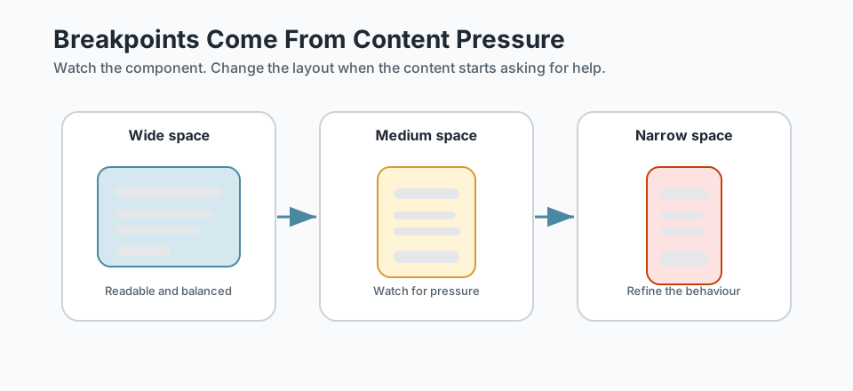
A breakpoint is not a phone size. It is a point where the content needs the layout to change. The content might be asking for help if:
- text lines become too long to read comfortably
- buttons or links feel squeezed
- a card becomes too narrow for its content
- spacing feels huge on small screens or cramped on larger screens
- a multi-column layout no longer supports the content well
Checkpoint for Understanding
Pause here and check whether the breakpoint decision is clear before adding more CSS.
- What should decide a breakpoint: a device name or the content itself?
- Why is a reusable component harder to refine than a one-off page section?
- Predict what happens if every component has unrelated breakpoint values.
Show sample answers
- The content should decide. Add a breakpoint when the component becomes cramped, awkward, too wide, or hard to read.
- Because the component may appear in different page contexts. Its CSS needs to protect the pattern without assuming one exact page width or location.
- The page can start to feel jumpy and inconsistent because each piece changes rhythm at a different moment for no clear content reason.
How confident are you with this concept?
Still confused | Getting there | Got it | Could explain it to a friend
Think in Component Behaviour
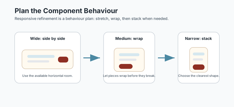
Before writing a media query, describe what the component should do as space changes. This keeps your CSS tied to behaviour instead of guesswork.
- A navigation list may wrap before becoming a stacked list.
- A CTA block may sit side-by-side when wide and stack when narrow.
- A card grid may create fewer columns as cards reach their minimum readable width.
- A media object may move its image above the text when the content becomes cramped.
Use Fluid Spacing and Type
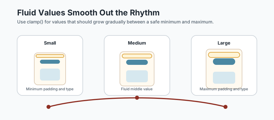
Not every responsive adjustment needs a hard breakpoint. Some values can scale smoothly between a minimum and maximum. This is especially useful for section padding, card padding, gaps, and headings.
:root {
  --space-section: clamp(2rem, 6vw, 5rem);
  --space-card: clamp(1rem, 3vw, 2rem);
  --text-heading: clamp(2rem, 5vw, 4rem);
}

.section {
  padding-block: var(--space-section);
}

.menu-card {
  padding: var(--space-card);
}

.hero-title {
  font-size: var(--text-heading);
}
Read clamp() in plain English: use this minimum value, prefer this flexible middle value, but never exceed this maximum value. That gives the layout a smoother rhythm without writing a media query for every width.
Use Media Queries When Behaviour Needs to Change
Media queries are still important. The refinement is knowing what they are for. Use a media query when a component needs a different layout behaviour, not just because a screen matches a popular device size.
.cta-block__inner {
  display: flex;
  align-items: center;
  justify-content: space-between;
  gap: 1.5rem;
  flex-wrap: wrap;
}

@media (max-width: 42rem) {
  .cta-block__inner {
    align-items: flex-start;
  }

  .cta-block .button {
    width: 100%;
    text-align: center;
  }
}
This media query is tied to a real component behaviour: when the CTA gets narrow, the button becomes easier to tap and easier to scan as a full-width action.
A Brief Note on Container Queries
Container queries let a component respond to the size of its container instead of the size of the whole viewport. That is powerful for reusable components because a card in a sidebar may need different behaviour from the same card in a wide grid.
You do not need container queries for Black Swan Bistro Part 4. For now, know that they exist and that they extend the same idea: responsive decisions should be based on the space a component actually has.
Responsive Refinement Checklist
When refining a reusable component, run through this quick checklist:
- Does the component still make sense with more or less text?
- Does it have a readable maximum width?
- Does it have a safe minimum width?
- Can it wrap or stack before it breaks?
- Are spacing and typography fluid enough to avoid harsh jumps?
- Are links, buttons, and focus states still easy to use?
- Does the component CSS avoid depending on one specific page location?
Keep the responsibility clear: page layout decides where a component sits. Component CSS decides how the component protects its own readability and usability.
Guided Practice
Refine one reusable component across widths
Use responsive refinement on one component without turning it into a full page redesign.
Step 1: Choose one reusable component
Choose a component from your recent work, such as a menu card, CTA block, feature card, or navigation pattern. Do not redesign the whole page. Focus on one reusable pattern.
Need a hint?
Step 2: Find the pressure points
Resize the browser or use DevTools responsive mode. Note the widths where the component starts to feel uncomfortable: text lines too long, buttons squeezed, cards too narrow, or spacing too heavy.
Need a hint?
Step 3: Add the smallest useful refinement
Refine the component with flexible rules first: gap, flex-wrap, minmax(), max-width, clamp(), or fluid padding. Add a media query only when the flexible rule is not enough.
Need a hint?
Step 4: Re-check the component in context
Place the component back into the page and test it near other sections. Make sure the component works on its own without breaking the shared page rhythm.
Need a hint?
You are on track if you can:
- You identified a content problem before adding CSS
- You used flexible CSS before adding extra breakpoints
- Your component stays readable at narrow, medium, and wide widths
- Your changes still make sense when the component appears inside a page
Independent Practice
Independent Practice: Make a shared component more resilient
Apply the responsive refinement process to a different component or section.
Your Task:
Choose a reusable component such as a menu card, service card, CTA block, testimonial, or navigation pattern. Improve its responsive behaviour in about 10-20 minutes.
Do not rebuild the whole design. Focus on one component and one or two meaningful responsive improvements.
Requirements:
- Identify the content pressure before changing CSS
- Use at least one flexible rule such as flex-wrap, minmax(), max-width, gap, or clamp()
- Add a media query only if the component behaviour genuinely changes
- Test the component at narrow, medium, and wide widths
- Write one sentence explaining why your breakpoint or flexible rule exists
Stretch Goals (Optional):
- Try a container-query version after the main solution works
- Test the component with longer text to see whether the refinement still holds
Success Criteria:
| Criteria | You've succeeded if... |
|---|---|
| Content-first decision | The learner can point to the content pressure that caused each responsive change. |
| Reusable behaviour | The component does not depend on one page-specific width, section, or layout context. |
| Smooth rhythm | Spacing, text size, and layout changes feel connected rather than jumpy. |
| Accessibility basics | The component remains readable, tappable, and keyboard-visible across widths. |
Recap
Responsive refinement is the difference between a layout that technically shrinks and a component that continues to feel clear, usable, and intentional. Start with the content. Use flexible CSS first. Add breakpoints when behaviour needs to change. Keep page layout and component behaviour separate.
This prepares you for multi-page work because the same header, footer, cards, and CTA blocks need to survive more than one context.
Lesson Complete: You Can Refine Components Responsively
Key Takeaways:
- Responsive refinement starts with content pressure, not device labels.
- Reusable components need flexible defaults because they may appear in more than one page context.
- Fluid spacing and type can reduce the number of hard breakpoints you need.
- Media queries are still useful, but they should solve a real layout problem.
- Container queries are a modern extension to this thinking, but they are not required for this stage.
Learning Objectives Review:
Look back at what you set out to learn. Can you now:
- Choose breakpoints based on content behaviour instead of device names Check!
- Refine reusable components with flexible layout rules before adding media queries Got it!
- Use clamp(), relative units, wrapping, and gap to keep spacing and typography fluid Can explain it!
- Explain the difference between viewport-based and component-context responsive decisions Could teach this!
- Prepare shared components for the multi-page Black Swan Bistro work in Part 4 Check!
If you can confidently answer "yes" to most of these, you're ready to move on!
Think & Reflect:
Responsive Decisions
- Which component in your current project feels most fragile when the viewport changes?
- What content behaviour tells you it needs a breakpoint or flexible rule?
Reusable Components
- Which responsive rules belong to the component itself?
- Which rules should stay with the page layout around the component?
Looking Ahead:
Recommended Next Steps
Continue Learning
Ready to move forward? Continue with the next tutorial in this series:
Multi-page StructureRelated Topics
Explore these related tutorials to expand your knowledge:
Additional Resources
Deepen your understanding with these helpful resources:
- MDN: Responsive Design - A solid refresher on media queries, flexible layouts, and responsive decisions.
- MDN: Using Media Queries - Reference for writing media queries when component behaviour needs to change.
- MDN: CSS Values and Units - Useful background for relative units, viewport units, and flexible CSS values.
- MDN: CSS Container Queries - A later extension topic for components that need to respond to their own container size.
- web.dev: Responsive design basics - Useful for reinforcing content-first breakpoint decisions and practical responsive patterns.