Flexbox for Real Layouts
Go beyond the basics with stronger Flexbox decisions for navigation, cards, footers, and split sections.
Flexbox Is More Than Centering
Many beginners first meet Flexbox through small examples: centering one box, pushing a logo to one side, or lining up a few links in a row. Those are useful starting points, but real sites ask more interesting questions.
How should a navigation bar behave when space gets tighter? How should a card footer push its button to the bottom? How should a call-to-action section keep two related pieces connected without becoming fragile?
This lesson is about using Flexbox as a layout tool, not just a trick.
- When you use Flexbox, do you usually think in terms of a row or column first?
- Have you ever made a layout work with Flexbox without feeling sure why it worked?
- Which parts of a homepage seem like one-direction layout problems rather than full grids?
This lesson prepares you for the component refactor in Black Swan Bistro Part 3 by making navigation, card groups, and shared layout patterns easier to reason about.
Learning Objectives
By the end of this lesson, you'll be able to:
- Use axis thinking to make Flexbox choices more deliberately
- Apply Apply Flexbox to navigation bars, card internals, and split content sections
- Handle wrapping, spacing, and alignment in ways that survive different screen widths
- Know when Flexbox is the right tool and when another layout method is better
Why This Matters:
Intermediate CSS is not about memorising more properties. It is about choosing the right layout tool for the shape of the content. Flexbox is one of the most useful places to practise that habit.
Before You Start:
You should be familiar with:
- CSS Systems for Reusable Sections Review here
- Flexbox Basics Review here
Flexbox Mental Model
Flexbox is strongest when your main layout problem happens in one direction. That direction might be horizontal, like a row of nav links, or vertical, like content stacked inside a card. The important part is that one relationship is primary.
This is why Flexbox fits so many practical interface patterns:
- Navigation bars
- Button groups
- Header and footer clusters
- Card internals with title, text, and action
- Simple side-by-side content blocks
Good question to ask first: what is the main direction of this relationship? If the answer is not clear, Flexbox may not be the best tool.
Think in Axes, Not Just Rows
The biggest shift from beginner Flexbox to intermediate Flexbox is axis thinking. A row is only one version of a main axis. A column is another.
.nav {
  display: flex;
  justify-content: space-between;
  align-items: center;
}

.card-body {
  display: flex;
  flex-direction: column;
  gap: 1rem;
}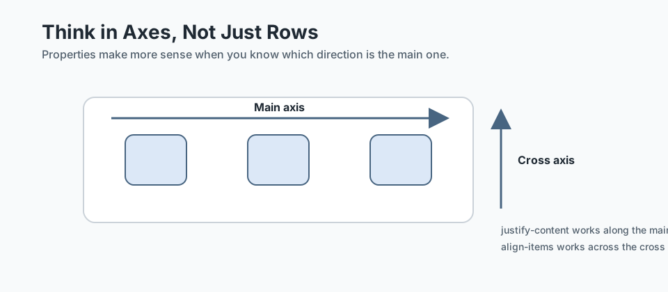
justify-content and align-items stop feeling random. In the first example, the main axis runs left to right. In the second, the main axis runs top to bottom. The properties are not random. They are serving the chosen axis.
Practical translation
justify-contentcontrols distribution along the main axisalign-itemscontrols alignment across the cross axisgapcreates consistent space between flex items
Checkpoint for Understanding
Pause here and check whether the axis model is clear before you move into specific layout patterns.
- If a layout's main relationship runs left to right, which axis is Flexbox primarily managing?
- Why is a card body often a good use of flex-direction: column?
- Predict what happens if a navigation cluster is built as one rigid row with no wrapping or gap strategy.
Show sample answers
- The main axis. That is why properties like justify-content control space distribution in that primary direction.
- Because the card's internal relationship usually runs top to bottom: title, text, metadata, and action all need a controlled vertical flow.
- It is more likely to collide, overflow, or become cramped when the viewport narrows or the link text becomes longer.
How confident are you with this concept?
Still confused | Getting there | Got it | Could explain it to a friend
Use Flexbox for Navigation Patterns
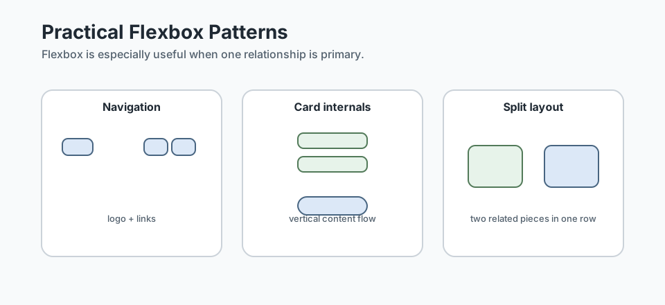
Navigation is one of the clearest real-world Flexbox cases. You often need a logo or site title on one side and a cluster of links on the other.
.site-header {
  display: flex;
  justify-content: space-between;
  align-items: center;
  gap: 1rem;
}

.site-nav ul {
  display: flex;
  flex-wrap: wrap;
  gap: 1rem;
  list-style: none;
  margin: 0;
  padding: 0;
}
This is stronger than using margins to push links around one by one. It keeps the relationship between the logo and nav visible in the code.
Why this matters for BSB
- The header pattern can be reused across multiple pages later.
- The nav links can wrap rather than colliding when space gets tighter.
- The layout intent stays readable when you return to the CSS later.
Use Flexbox Inside Cards and Content Groups
Flexbox is not only for page-level rows. It is also excellent inside repeated pieces. A card is often a small vertical layout problem: title, text, metadata, and action.
.card {
  display: flex;
  flex-direction: column;
  gap: 1rem;
  height: 100%;
}

.card-action {
  margin-top: auto;
}
That last line is especially useful. It allows the action area to settle at the bottom of the card even when card content lengths differ. This makes repeated card layouts feel more stable.
Useful habit: use Flexbox inside a repeated component when the internal structure needs controlled vertical or horizontal relationships.
Use Flexbox for Simple Split Layouts
Some sections contain two related pieces that need to sit side by side on wider screens: for example, text and image, booking copy and button, or address and opening hours. Flexbox is often the simplest tool for that job.
.cta-row {
  display: flex;
  justify-content: space-between;
  align-items: center;
  gap: 2rem;
}

.cta-row > * {
  flex: 1 1 18rem;
}
This approach works well when the section is still mostly one-dimensional: two related items in one main relationship. If the layout starts needing strict rows and columns together, that is when Grid becomes a better conversation.
Treat Wrapping and Gap as First-Class Tools
Real layouts break when we pretend all content stays on one line forever. That is why flex-wrap and gap matter so much in practical CSS.
- Use
gapinstead of scattering margins across child elements. - Use
flex-wrapwhen a cluster of items needs to reflow gracefully. - Test what happens when text becomes longer than expected.
.link-cluster {
  display: flex;
  flex-wrap: wrap;
  gap: 0.75rem 1rem;
}
This is especially helpful for navigation, tag groups, social links, and footer link clusters.
When Flexbox Is the Wrong Tool
Better Flexbox usage includes knowing when not to use it. Flexbox is not the answer to every layout problem.
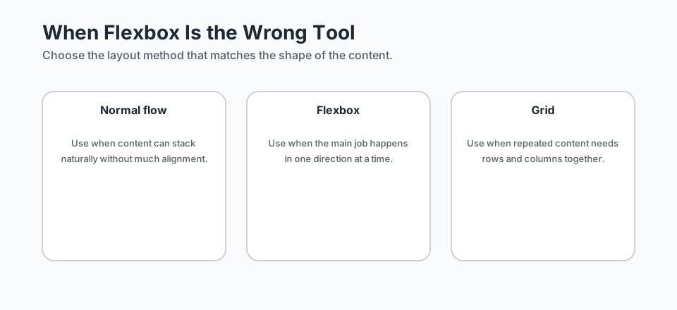
- Use normal document flow when content can simply stack naturally.
- Use Grid when repeated content needs row and column relationships together.
- Do not force Flexbox into layouts that are really two-dimensional.
Common mistake: if you find yourself fighting widths, forcing equal rows, and manually controlling several directions at once, you may be trying to solve a Grid problem with Flexbox.
Responsive Checks for Flexbox Layouts
A Flexbox layout is only successful if it still makes sense when space changes. Before you trust a pattern, check these things:
- Does the content still read clearly when items wrap?
- Does the gap stay comfortable at smaller widths?
- Should the layout remain a row, or switch to a column?
- Are actions still reachable and readable when space tightens?
@media (max-width: 768px) {
  .cta-row {
    flex-direction: column;
    align-items: flex-start;
  }
}
This kind of change is easier once the original relationship is already clear. That is another reason Flexbox works well when the content has a strong main axis.
Guided Practice
Build a small Flexbox layout on purpose
Use the lesson's ideas to set up one-direction layout relationships more deliberately instead of relying on trial and error.
Step 1: Set up the main relationship
Imagine a simple site header with a logo on the left and navigation links on the right. Apply display: flex to the header wrapper and decide how the items should relate along the main axis.
Your goal is not just to make the items sit in a row. Your goal is to make the relationship between the two sides clear.
Need a hint?
Step 2: Make the inner group behave well
Now style the navigation list itself as a flex container. Add gap and allow wrapping if needed.
This is where the layout becomes more resilient than a row built from manual spacing.
Need a hint?
Step 3: Check a second Flexbox use case
Apply the same thinking to a card or call-to-action row. Use Flexbox to control the relationship between the internal pieces, then decide what should happen when space gets tighter.
Need a hint?
You are on track if you can:
- You identified the main axis of the layout before choosing properties
- You used Flexbox for both a container-level relationship and an inner content group
- You used gap or wrapping to support the layout cleanly
- You can explain why Flexbox fits these examples better than one-off spacing tricks
Independent Practice
Independent Practice: Choose the right Flexbox pattern
Now apply the concept in a slightly new layout situation without step-by-step guidance.
Your Task:
Sketch or build a small restaurant page section that includes two related content areas, such as a booking call-to-action, a footer link cluster, or an image-and-text promo row.
Use Flexbox deliberately to manage the main relationship, and decide what should happen when the layout gets narrower.
Requirements:
- Use Flexbox for a clear one-dimensional layout relationship
- Include spacing with gap or another deliberate alignment choice
- Describe what should happen on a narrower screen
- Write one short note explaining why Flexbox fits this case
Stretch Goals (Optional):
- Apply Flexbox both to the outer section and to one smaller repeated internal group
- Identify one part of the layout that should not use Flexbox and explain why
Success Criteria:
| Criteria | You've succeeded if... |
|---|---|
| Axis thinking | The layout choices clearly match the main direction of the content relationship. |
| Practical Flexbox use | Flexbox is used for real grouping or alignment problems rather than as a generic default. |
| Responsive resilience | The pattern still makes sense when content wraps or when the layout shifts for a smaller screen. |
| Tool choice | The learner can explain why this example is a Flexbox problem instead of a Grid or normal-flow problem. |
Additional Resources
These are especially useful if you want to strengthen your practical Flexbox decision making:
- CSS-Tricks: A Complete Guide to Flexbox - useful for revisiting the full property set with visual examples.
- Every Layout - useful for connecting Flexbox decisions to real patterns like cluster, sidebar, and stack.
Recap
Flexbox becomes much more useful when you stop thinking of it as a centering shortcut and start seeing it as a tool for one-dimensional relationships. Navigation, card internals, footer clusters, and split sections all become easier once you think in axes, wrapping, and alignment.
Lesson Complete: You Can Use Flexbox More Deliberately
Key Takeaways:
- Flexbox works best when the main layout job happens in one direction at a time.
- Axis thinking matters more than memorising property names.
- Gap, wrapping, and alignment decisions usually matter more in real layouts than centering tricks.
- Using Flexbox well includes knowing when to stop and choose Grid or normal flow instead.
Learning Objectives Review:
Look back at what you set out to learn. Can you now:
- Explain the main axis and cross axis in practical terms Check!
- Use Flexbox more deliberately in navigation, cards, and split content areas Got it!
- Handle wrapping and spacing in a way that survives responsive changes Can explain it!
- Recognise when a repeated layout problem is not really a Flexbox problem Could teach this!
If you can confidently answer "yes" to most of these, you're ready to move on!
Think & Reflect:
Axis Choices
- When you look at a layout now, can you tell whether the main relationship is horizontal or vertical?
- Which Flexbox rule feels easier to understand once you think in terms of a main axis?
Tool Choice
- Which part of your page is truly one-dimensional, and which part is starting to become a grid?
- Where have you used Flexbox in the past when a different layout approach would have been clearer?
Looking Ahead:
Recommended Next Steps
Continue Learning
Ready to move forward? Continue with the next tutorial in this series:
Building Reusable ComponentsRelated Topics
Explore these related tutorials to expand your knowledge:
Additional Resources
Deepen your understanding with these helpful resources:
- CSS-Tricks: A Complete Guide to Flexbox - A visual guide for axis thinking, alignment, wrapping, and practical layout decisions.
- Every Layout - Useful for deciding when a row, cluster, or sidebar pattern is really a Flexbox problem.