How to Think About Layouts (Before You Write Any Code)
A mental model for breaking a design into rows, columns, and sections.
Do Not Start with CSS Properties
When beginners see a homepage design, they often ask questions like: should I use Flexbox here, how many pixels of padding does this need, or which font size should I start with?
Those are real questions, but they are not the first questions. The first job is to understand the shape of the page. What are the large regions? Which pieces belong together? Which things repeat?
When you answer those questions first, layout becomes much less confusing.
- Have you ever opened a design and immediately jumped into CSS without a plan?
- Do you tend to focus on colours and small details before overall structure?
- What might become easier if you pause and map the page first?
This lesson gives you the layout mental model you will use in the builder path and the Black Swan Bistro project.
Learning Objectives
By the end of this lesson, you'll be able to:
- See a page as a system of sections, groups, and repeated blocks
- Recognise hierarchy before choosing layout tools
- Describe Describe whether a part of a page behaves like a row, column, or grid
- Sketch a simple wireframe that turns a design into something code-ready
Why This Matters:
Most layout problems become easier once you stop thinking in isolated elements and start thinking in relationships. This lesson trains that habit.
Before You Start:
You should be familiar with:
- Box Model Review here
- Selectors & Properties Review here
Layout Mental Model
A webpage is not just a pile of boxes. It is a structure made of large regions, smaller groups inside those regions, and repeated patterns inside those groups.
That means you can think in layers:
- Page-level regions such as header, main content, and footer
- Section-level groups such as hero, features, gallery, and call to action
- Repeated pieces such as cards, buttons, and navigation links
Step 1: See the Big Shapes First
When you first open a design, resist the urge to read every word or inspect every small detail. Squint a little and ask: what are the biggest visible blocks on the page?
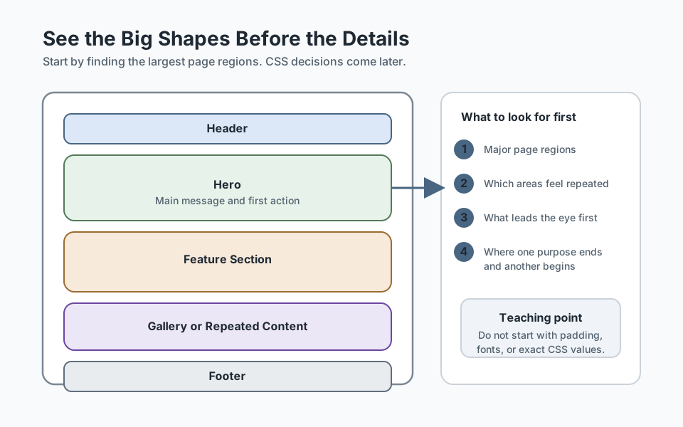
[ Header ]
[ Hero ]
[ Feature section ]
[ Testimonial section ]
[ Contact section ]
[ Footer ]
This simple pass helps you stop treating the whole page as one giant problem. Instead, you start seeing a manageable set of sections.
Step 2: Look for Content Hierarchy
Every section has its own internal hierarchy. Usually there is a title, supporting text, and then one or more actions or content groups. Layout works better when you know what needs attention first.
- What is the main message of this section?
- What is secondary information?
- What is repeated?
- What is optional or decorative?
Step 3: Think in Rows and Columns
Many layouts become easier when you ask a simple question: is this mainly a row, a column, or a repeated matrix?
- A nav bar is often a row of related items.
- A mobile section stack is often a column of content blocks.
- A gallery or card collection is often a repeated grid.
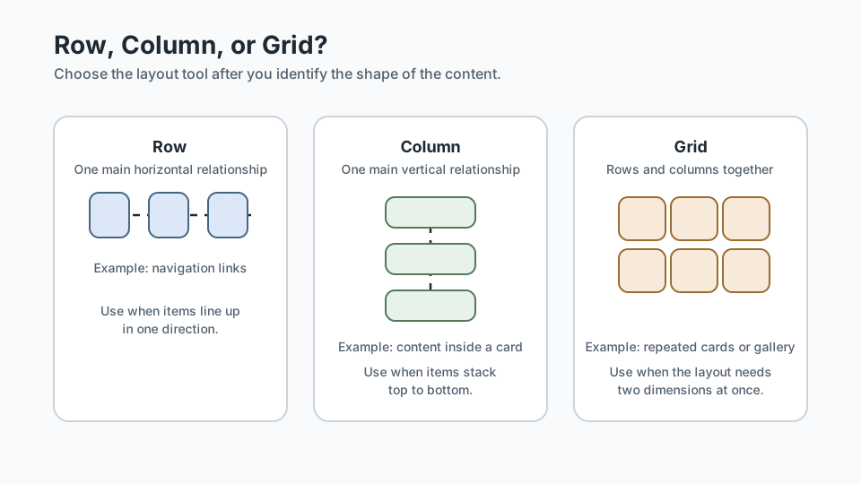
Helpful rule: if the main job is lining things up in one direction, think one-dimensional. If the main job is arranging repeated blocks in rows and columns, think two-dimensional.
Checkpoint for Understanding
Pause here and check whether you are reading structure before jumping to tool choice.
- When you first inspect a page, why is it useful to look for the biggest regions before the smaller details?
- What is the difference between a page-level section and a repeated block inside that section?
- Predict what happens when you choose Flexbox or Grid before understanding the shape of the content first.
Show sample answers
- Because seeing the largest structural pieces reduces confusion and turns the page into a manageable set of layout decisions instead of one giant problem.
- A page-level section carries a larger content purpose, while a repeated block is usually one smaller pattern inside that section, such as a card or link cluster.
- Tool choice becomes guesswork, which usually leads to messier layout decisions and more time spent correcting the structure later.
How confident are you with this concept?
Still confused | Getting there | Got it | Could explain it to a friend
Step 4: Choose the Right Layout Tool
Once you understand the shape, tool choices become less mysterious.
- Use normal document flow when content can simply stack naturally.
- Use Flexbox when items need alignment in one main direction.
- Use Grid when repeated content needs rows and columns together.
This is why layout thinking matters more than memorising syntax. The tool should serve the shape of the content.
Step 5: Make a Simple Wireframe
Before coding, sketch a stripped-back version of the page. It can be text-only. The point is to map structure, not create art.
[ Header: logo + nav ]
[ Hero: title + text + button ]
[ Three feature cards ]
[ About text block ]
[ Gallery grid ]
[ Footer links ]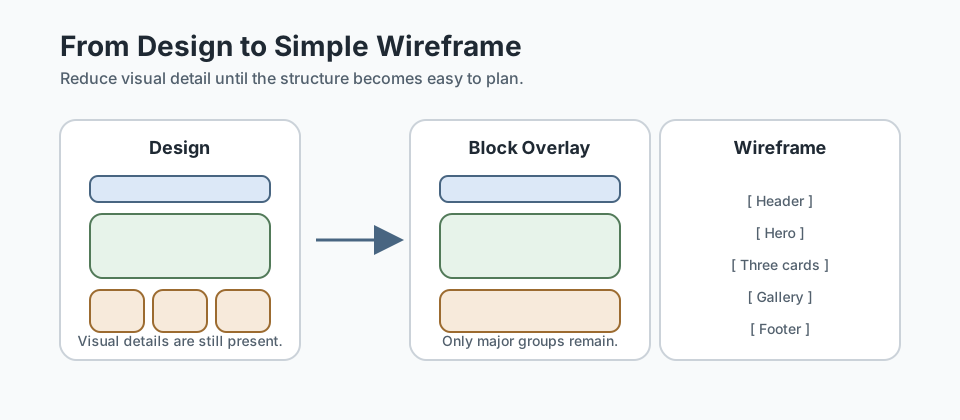
If you can make this kind of rough layout plan, you are already doing one of the most important design-to-code jobs.
Guided Practice
Turn a visual page into a layout plan
Use the lesson's process in order so you practise seeing structure before making CSS decisions.
Step 1: Mark the biggest page regions
Take a homepage, landing page, or mockup you can see clearly. Ignore colours and detailed copy for a moment and mark the biggest regions first: header, hero, main content sections, and footer.
Your goal is to reduce the page to major structural pieces.
Need a hint?
Step 2: Label the internal relationships
Inside one or two sections, identify what feels like a row, what feels like a column, and what looks like a repeated matrix or collection.
Do not choose CSS yet. Just describe the relationship.
Need a hint?
Step 3: Turn the observation into a wireframe
Rewrite the page as a simple text-only wireframe. Focus on structure, hierarchy, and repeated blocks rather than decoration.
This is the bridge between looking at the page and writing HTML or CSS later.
Need a hint?
You are on track if you can:
- You identified the main page regions before worrying about individual elements
- You described at least one section as a row, one as a column, or one as a repeated collection
- You produced a simple wireframe that could guide later HTML and CSS work
- You can explain why your tool choices should come after this structural step
Independent Practice
Independent Practice: Read a fresh layout
Now try the same skill on a different page without step-by-step support.
Your Task:
Choose a different homepage, restaurant site, portfolio page, or simple landing page. Break it into major regions, identify the internal relationships of at least two sections, and sketch a short wireframe plan.
Your goal is not to style it. Your goal is to understand the page well enough that writing HTML and choosing layout tools would feel clearer afterward.
Requirements:
- Identify the main page regions first
- Describe at least two internal relationships such as row, column, or repeated collection
- Write a short wireframe or outline of the page structure
- Explain one tool choice you would likely make later and why
Stretch Goals (Optional):
- Compare two sections and explain why one feels one-dimensional while the other feels two-dimensional
- Note one repeated pattern that might become a reusable block later
Success Criteria:
| Criteria | You've succeeded if... |
|---|---|
| Structural clarity | The page is broken into sensible large regions before smaller groups are analysed. |
| Relationship thinking | Rows, columns, and repeated collections are identified based on content shape rather than guesswork. |
| Wireframe usefulness | The wireframe is simple but detailed enough to guide later implementation. |
| Transfer of idea | The learner can explain how this layout-reading process would help before writing HTML or CSS. |
Additional Resources
If this way of thinking clicks for you, these resources are excellent for building stronger layout mental models:
- Every Layout - especially helpful for ideas like stack, center, cluster, sidebar, and grid as reusable layout patterns instead of one-off tricks.
- BEM - Block Element Modifier - useful once you start naming repeated layout and UI patterns more deliberately.
Recap
Thinking about layout is really the skill of seeing structure clearly before you start styling. Once you can spot big sections, hierarchy, rows, columns, and repeated blocks, coding the page becomes much more straightforward.
Lesson Complete: You Can Read the Shape of a Page
Key Takeaways:
- Good layout thinking starts before code, not after it.
- Most pages can be understood as sections, groups, rows, columns, and repeated blocks.
- Layout is about hierarchy and relationships, not just where boxes sit on the screen.
- Choosing between normal flow, Flexbox, and Grid gets easier once you understand the shape of the content.
Learning Objectives Review:
Look back at what you set out to learn. Can you now:
- Break a page into large structural pieces before writing CSS Check!
- Recognise relationships between parent sections and smaller repeated groups Got it!
- Explain when a layout is mostly one-dimensional or two-dimensional Can explain it!
- Sketch a simple low-fidelity wireframe from a visual design Could teach this!
If you can confidently answer "yes" to most of these, you're ready to move on!
Think & Reflect:
Seeing Structure
- When you first look at a page, do you notice details before structure?
- What changed when you started looking for groups instead of individual elements?
Layout Decisions
- Which parts of a page usually behave like a row or column?
- Which parts are better treated as repeated cards or a grid?
Looking Ahead:
Recommended Next Steps
Continue Learning
Ready to move forward? Continue with the next tutorial in this series:
How to Read a DesignRelated Topics
Explore these related tutorials to expand your knowledge:
Additional Resources
Deepen your understanding with these helpful resources:
- Every Layout - A layout-focused mental-model resource built around reusable composition patterns.
- BEM — Block Element Modifier - A clear naming approach for repeated layout and interface patterns.