Building Reusable Components
Create cards, buttons, navigation groups, and footer patterns you can reuse across pages.
Components Are Patterns You Can Trust
After building a few sections, you start noticing that some pieces repeat: cards, buttons, navigation links, footer groups, and call-to-action blocks. At first, copying and editing them feels fast. Later, it becomes fragile.
Reusable component thinking solves that problem. You do not need Vue, React, or any framework yet. You need to learn how stable HTML and CSS patterns work before tools automate them for you.
That is the goal of this lesson: build reusable pieces while still understanding the fundamentals underneath.
- Which repeated pieces have you already copied from one part of a page to another?
- What usually changes between repeated cards or buttons?
- What would become easier if those repeated pieces had a predictable structure?
This lesson prepares you for Black Swan Bistro Part 3, where repeated homepage patterns become reusable structures for cards, navigation, and footer content.
Learning Objectives
By the end of this lesson, you'll be able to:
- Describe Describe reusable components as stable HTML and CSS patterns
- Identify Identify repeated pieces that are worth turning into component-style structures
- Create Create a simple contract between component markup and component CSS
- Build reusable card, button, nav, and footer patterns without using a framework
- Decide when variation belongs inside a component and when it should stay section-specific
Why This Matters:
Component thinking helps you stop solving the same layout and styling problem from scratch. The aim is not abstraction for its own sake. The aim is clearer, more maintainable HTML and CSS.
Before You Start:
You should be familiar with:
- CSS Systems for Reusable Sections Review here
- Flexbox for Real Layouts Review here
Building on CSS Systems: In CSS Systems for Reusable Sections, you organised shared tokens, spacing values, and naming rules so your CSS stays consistent as a site grows. This tutorial takes that further. Instead of shared styles alone, you will define stable HTML structures - markup and CSS together - that you can reuse across sections and pages.
What Components Mean Without a Framework
When people talk about components, they often mean framework components. Those are useful later, but the idea starts much earlier. In plain HTML and CSS, a component is a repeated piece of interface with a predictable structure and predictable styling.
That means a component-style pattern usually has:
- A clear purpose, such as showing a menu item, action, or link group
- A stable HTML shape that repeats
- Class names that describe the component and its parts
- CSS that styles the shared pattern instead of one single instance
Important idea: reusable components are not about hiding HTML and CSS. They are about making repeated HTML and CSS easier to reason about.
Pattern vs Component
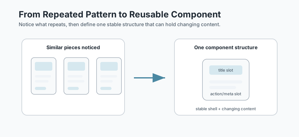
A pattern is something you notice. A component-style structure is something you define deliberately.
For example, after BSB Part 2 you may notice that the homepage has several cards. That is a pattern. It becomes a reusable component-style pattern when you decide what the card structure should be and how its CSS should work every time it appears.
<article class="menu-card">
  <h3 class="menu-card__title">Pan-Seared Barramundi</h3>
  <p class="menu-card__description">
    Lemon butter, asparagus, and crushed potatoes.
  </p>
  <p class="menu-card__meta">$34</p>
</article>
The exact dish changes. The structure stays stable. That is the shift from "several similar cards" to "a reusable card pattern."
Checkpoint for Understanding
Pause here and check whether the component idea is clear before you build one.
- What makes a repeated card pattern different from a reusable component-style pattern?
- Why should a component have a small "contract" between its HTML and CSS?
- Predict what happens if every card, button, or footer section gets its own unique markup and class names.
Show sample answers
- A repeated card pattern becomes component-style when it has a stable HTML structure, predictable class names, and clear rules about which parts can change.
- The contract makes the component easier to reuse because the markup and CSS agree on what each class is responsible for.
- The site becomes harder to maintain because repeated parts cannot share styling or structure reliably.
How confident are you with this concept?
Still confused | Getting there | Got it | Could explain it to a friend
Create a Component Contract
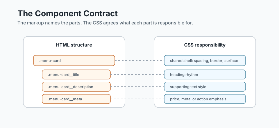
A reusable component works best when the HTML and CSS have a small agreement. You can think of this as a component contract:
- The outer class names the component.
- Inner classes name meaningful parts of the component.
- The CSS styles those parts predictably.
- New content can be swapped in without changing the whole structure.
.menu-card {
  padding: var(--space-md);
  background: var(--color-surface);
  border: var(--border-soft);
  border-radius: var(--card-radius);
}

.menu-card__title {
  margin-bottom: 0.5rem;
}

.menu-card__description {
  color: var(--color-text-muted);
}

.menu-card__meta {
  font-weight: 700;
}
This does not require a strict naming system, but it does require consistency. If the class names change randomly from card to card, the component becomes harder to reuse.
Build a Card Component
Cards are a good first component-style pattern because they repeat often and have clear internal parts. A card usually has a shell, a title, supporting text, and sometimes an image, metadata, or action.
<article class="feature-card">
  <img class="feature-card__image" src="images/dish.jpg" alt="Seasonal pasta dish">
  <div class="feature-card__body">
    <h3 class="feature-card__title">Seasonal Menu</h3>
    <p class="feature-card__text">
      Fresh dishes built around local produce.
    </p>
    <a class="button-primary feature-card__action" href="menu.html">
      View Menu
    </a>
  </div>
</article>
Notice that the image, title, text, and action are allowed to change. The component structure does not need to change every time.
Buttons and Actions
Buttons and links are another strong place to practise reuse. A primary action should feel consistent whether it appears in the hero, a card, or a booking section.
.button-primary {
  display: inline-block;
  padding: 0.75rem 1.25rem;
  background: var(--color-accent);
  color: white;
  text-decoration: none;
  border-radius: 999px;
}

.button-secondary {
  display: inline-block;
  padding: 0.75rem 1.25rem;
  color: var(--color-accent);
  border: 1px solid currentColor;
  border-radius: 999px;
}
The key is to keep the action style reusable while still using the correct HTML. If the action navigates somewhere, use a link. If it submits or triggers an interface action, use a button.
Navigation and Footer Systems
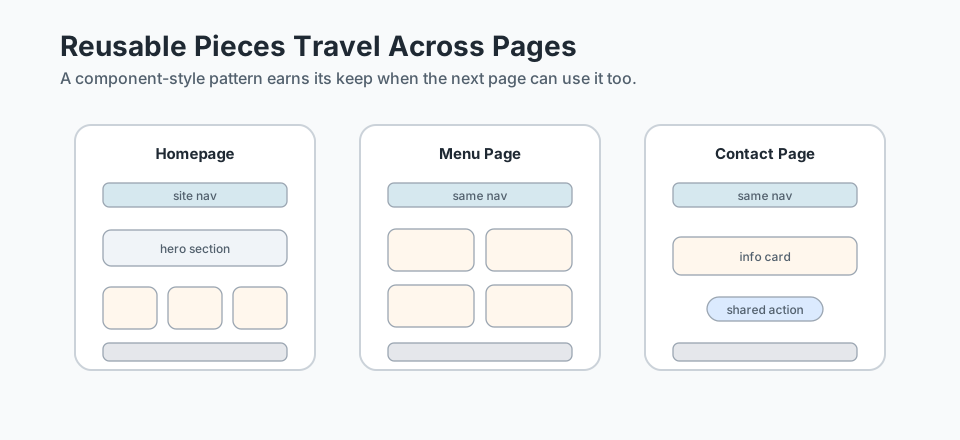
Navigation and footer areas are not single cards, but they still benefit from component-style thinking. They repeat across pages and need predictable structure.
<nav class="site-nav" aria-label="Main navigation">
  <ul class="site-nav__list">
    <li><a class="site-nav__link" href="index.html">Home</a></li>
    <li><a class="site-nav__link" href="menu.html">Menu</a></li>
    <li><a class="site-nav__link" href="contact.html">Contact</a></li>
  </ul>
</nav>
The structure stays stable as you move from page to page. That makes Part 4's multi-page work much easier later.
Reusable Component Checklist
Before calling something reusable, check it against a few practical questions:
- Does this pattern appear more than once, or is it likely to?
- Can the HTML structure stay mostly the same each time?
- Are the class names describing purpose instead of decoration?
- Can content change without rewriting the component?
- Does the component still use semantic HTML?
- Are focus, link, and button states still clear?
Keep it grounded: not every piece needs to become reusable. If something appears once and has a very specific purpose, a simple section-specific rule may be clearer.
Guided Practice
Turn a repeated card into a reusable component-style pattern
Use a repeated piece from a homepage and define its structure, class responsibilities, and shared styling.
Step 1: Choose one repeated pattern
Start with a repeated piece from a homepage, such as a dish card, feature card, button, or footer link group. Write down what stays the same each time it appears and what changes from one instance to the next.
Need a hint?
Step 2: Define the HTML structure
Create a small, predictable markup structure for that pattern. Use purposeful classes such as .menu-card, .menu-card__title, and .menu-card__action.
Keep the markup semantic first. Classes should support styling, not replace meaningful HTML.
Need a hint?
Step 3: Write CSS for the shared shell
Style the stable shell first: spacing, border, background, radius, and internal layout. Then add small rules for the variable parts, such as the title, meta text, or action area.
Need a hint?
You are on track if you can:
- You identified what stays the same and what changes in the repeated pattern
- You wrote semantic markup with predictable component-style class names
- You styled the shared shell before adding special-case rules
- You can reuse the component at least twice without changing its structure
Independent Practice
Independent Practice: Design one reusable pattern
Now apply component-style thinking to a new repeated interface piece.
Your Task:
Choose one repeated pattern from a small website idea: a testimonial card, menu item, service card, footer link group, or call-to-action block. Define the component's stable HTML structure and write the shared CSS rules it would need.
Keep the task small. You are building one reusable pattern, not a full site.
Requirements:
- Choose one realistic repeated interface pattern
- Identify what stays the same and what changes between instances
- Write semantic HTML for one instance of the pattern
- Write shared CSS for the component shell and key parts
- Explain how you would reuse the same pattern at least twice
Stretch Goals (Optional):
- Add one clearly named variant, such as a featured card or secondary action
- Add a focus or hover state that keeps the component accessible and readable
Success Criteria:
| Criteria | You've succeeded if... |
|---|---|
| Reusable structure | The pattern has a stable markup shape that can be repeated without rewriting it from scratch. |
| Clear class responsibility | Class names describe the component and its parts instead of temporary visual details. |
| Semantic HTML | The component uses meaningful elements for headings, links, lists, or content groups where appropriate. |
| Maintainable variation | Any variation is handled deliberately instead of creating a disconnected one-off component. |
Additional Resources
These are helpful once you are ready to keep strengthening component-style thinking without reaching for a framework too early:
- BEM - Block Element Modifier - useful for understanding component-like naming and predictable relationships between outer blocks and inner parts.
- Every Layout - useful for seeing reusable layout patterns as composable building blocks rather than one-off page tricks.
Recap
Reusable components are the next step after noticing repeated visual patterns. They give repeated HTML and CSS a stable shape, so cards, buttons, navigation, and footer pieces can move across pages without being rebuilt from scratch.
Lesson Complete: You Can Build Reusable HTML and CSS Patterns
Key Takeaways:
- Reusable components are stable HTML and CSS patterns, not framework-specific magic.
- A component-style pattern has a clear structure, clear class responsibilities, and predictable variation points.
- Cards, buttons, nav groups, and footers are good early candidates because they repeat across real websites.
- Good reusable components make the next page easier to build without hiding the underlying HTML and CSS.
Learning Objectives Review:
Look back at what you set out to learn. Can you now:
- Explain what component-style thinking means in plain HTML and CSS Check!
- Identify repeated patterns that are good candidates for reusable components Got it!
- Create a simple component contract between markup and styling Can explain it!
- Build reusable card, action, nav, or footer patterns without introducing a framework Could teach this!
If you can confidently answer "yes" to most of these, you're ready to move on!
Think & Reflect:
Reuse
- Which repeated piece in your current project would benefit most from becoming a reusable component-style pattern?
- What part of that pattern should stay stable every time it appears?
Structure
- Where would semantic HTML help your component stay understandable?
- What variation should be allowed without rewriting the whole component?
Looking Ahead:
Recommended Next Steps
Continue Learning
Ready to move forward? Continue with the next tutorial in this series:
Black Swan Bistro — Part 3: Refactor Repeated Patterns into ComponentsRelated Topics
Explore these related tutorials to expand your knowledge:
Additional Resources
Deepen your understanding with these helpful resources:
- BEM — Block Element Modifier - A useful naming model for reusable interface blocks and their internal parts.
- Every Layout - Helpful for understanding reusable layout patterns as small composable building blocks.