CSS Systems for Reusable Sections
Build a small CSS system with spacing, naming, and shared section patterns before you refactor components.
One Page Is Not the End of the Story
After Black Swan Bistro Part 2, you now have a homepage with repeated classes, shared spacing, and a clearer layout. That is progress, but it also creates a new problem: how do you stop that CSS from turning into a pile of one-off rules as the site grows?
This is where CSS system thinking starts. You do not need a giant framework or a complicated design system. You need a small set of reliable rules that make the next section and the next page easier to build.
That is what this lesson focuses on.
- Have you ever styled a second section and realised you were copying rules from the first?
- Which choices in your CSS feel stable enough to reuse across more than one part of the site?
- What becomes harder when spacing, colours, and naming are decided separately in every section?
This lesson sits between BSB Part 2 and the component refactor in Part 3. It helps you turn repeated styling choices into a small shared system.
Learning Objectives
By the end of this lesson, you'll be able to:
- Turn repeated homepage styling decisions into a small reusable CSS system
- Use custom properties as shared tokens for colour, spacing, and width
- Name classes by purpose so the CSS stays readable as the project grows
- Build repeatable section, card, and action patterns without introducing a framework
- Recognise when a style belongs in shared CSS instead of a one-off selector
Why This Matters:
A learner can build one page without a system. A learner who wants to build a maintainable site needs shared rules. This lesson teaches that bridge.
Why CSS Systems Matter
In a small project, it is easy to get away with section-specific CSS. You style the hero, then the gallery, then the footer, each as if it is a separate problem. The trouble appears later when you add another page or try to refactor repeated markup.
A small CSS system helps you answer questions like these more consistently:
- How wide should most content sit on the page?
- How much vertical spacing should sections share?
- What does a standard card shell look like?
- How should buttons and links feel related?
- Which rules belong everywhere, and which belong only in one section?
Important idea: a CSS system is not about making the site look identical everywhere. It is about making repeated decisions deliberate instead of accidental.
Start with Shared Tokens
In BSB Part 2, you already used custom properties for colour. That is the right starting point. Now expand that thinking a little. If the same spacing and width values appear again and again, they should be named once and reused.
:root {
  --color-page-bg: #f8f5f0;
  --color-surface: #ffffff;
  --color-text: #2d2a26;
  --color-accent: #8c5e3c;

  --space-xs: 0.5rem;
  --space-sm: 1rem;
  --space-md: 1.5rem;
  --space-lg: 3rem;
  --space-xl: 5rem;

  --content-width: 72rem;
  --card-radius: 0.75rem;
  --border-soft: 1px solid #e5ddd3;
}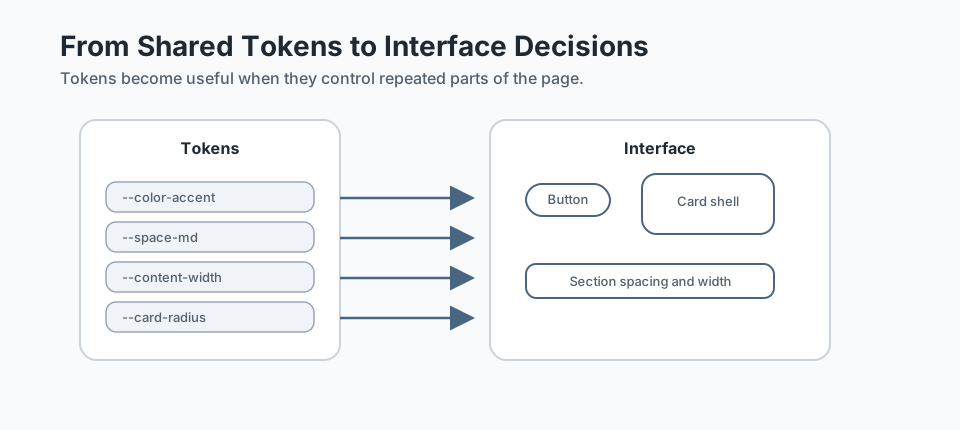
These values do not need to be perfect. They need to be intentional. The real benefit is that you stop making up new numbers for every section.
Why this helps
- Changing one value can improve consistency across the whole page.
- Spacing decisions become easier to explain and reuse.
- Later responsive adjustments are easier because you already know your core values.
Name by Purpose, Not Appearance
Naming is where many beginners either become too vague or too specific. A class like .brown-box may feel descriptive today, but it becomes awkward once the colour changes. A class like .left-section-large also ties the rule to a specific layout position that may not stay true.
Better names describe the job the class performs:
.containerfor a shared content width.sectionfor shared vertical rhythm.section-titlefor headings that repeat the same pattern.cardfor repeated content shells.buttonor.button-primaryfor action styles
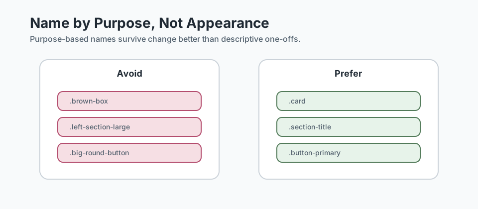
Helpful test: if you moved the class to another part of the page, would its name still make sense?
Checkpoint for Understanding
Pause here and check whether the first system ideas are making sense before you move on to section and pattern design.
- Why is a token like --space-lg more useful than writing 3rem in several different selectors?
- Which name is stronger for long-term reuse: .brown-box or .card? Why?
- Predict what happens if each section invents its own spacing and naming rules instead of sharing a system.
Show sample answers
- Because one named token can control a repeated spacing decision across multiple sections, which makes updates easier and keeps the layout more consistent.
- `.card` is stronger because it describes the job of the pattern, not a temporary visual detail that may change later.
- The CSS becomes harder to maintain, repeated patterns become less consistent, and adding new sections or pages takes more work.
How confident are you with this concept?
Still confused | Getting there | Got it | Could explain it to a friend
Build Section Patterns First
The most useful shared CSS often starts at section level. Before worrying about every small element, make sure your sections share a calm, readable structure.
.container {
  width: min(100% - 2rem, var(--content-width));
  margin-inline: auto;
}

.section {
  padding-block: var(--space-xl);
}

.section-title {
  margin-bottom: var(--space-md);
  font-size: 2rem;
  line-height: 1.2;
}

.section-intro {
  max-width: 42rem;
  margin-bottom: var(--space-lg);
}
These classes are not flashy, but they do a lot of heavy lifting. Once they exist, most new sections start from a familiar base instead of a blank slate.
Section-level questions to ask
- Does this section need the standard vertical rhythm, or is it a special case?
- Does the content need the shared page width, or a deliberately narrower measure?
- Can this heading reuse the same visual pattern as earlier section titles?
Standardise Repeated Pieces
Once your section shells are stable, look at the repeated pieces inside them. In BSB, that includes cards, calls to action, navigation links, and buttons.
Start with the shell before the variation:
.card {
  padding: var(--space-md);
  background: var(--color-surface);
  border: var(--border-soft);
  border-radius: var(--card-radius);
}

.card-grid {
  display: grid;
  gap: var(--space-md);
}

.button-primary {
  display: inline-block;
  padding: 0.75rem 1.25rem;
  background: var(--color-accent);
  color: white;
  text-decoration: none;
  border-radius: 999px;
}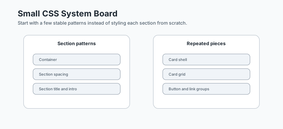
Notice the order of thinking here: first, define what the shared pattern is. After that, handle section-specific differences only where they are genuinely needed.
Avoid this trap: if every card on the site immediately gets its own unique class and styling rules, you do not really have a card pattern yet.
Organise Styles Without Overengineering
At this stage, you do not need a complex architecture or multiple build steps. You do need some discipline. Keep your CSS organised in a way another learner could read.
A simple order often works well:
- Root variables and document-wide basics
- Layout foundations such as container and section
- Repeated patterns such as cards, buttons, and link groups
- Section-specific adjustments only when shared rules are not enough
/* 1. Shared tokens */
:root { ... }

/* 2. Page-wide foundations */
body { ... }
.container { ... }
.section { ... }

/* 3. Reusable patterns */
.section-title { ... }
.card { ... }
.button-primary { ... }

/* 4. Section-specific adjustments */
.hero { ... }
.gallery { ... }
.footer { ... }
This keeps your system readable without pretending the project is bigger than it is.
Why this order matters - the cascade. CSS applies rules in a predictable order. When two rules target the same element with equal specificity, the one that appears later in the stylesheet wins. By placing shared foundations first and section-specific adjustments last, you let the natural cascade do the work - specific rules override general ones without needing higher-specificity selectors or !important.
If you covered Why Your CSS Isn't Working in the beginner section, this is the same principle applied to a real stylesheet structure. We will return to the cascade in depth in Cascade, Specificity, and Debugging CSS later in this pathway. For now, the key habit is: keep selector specificity low and consistent, and let source order handle the rest.
Accessibility Checks for Shared Styles
Shared styles should help accessibility, not quietly damage it. As your CSS system grows, check a few practical things:
- Do buttons and links keep enough colour contrast?
- Are spacing choices improving readability, not crowding content?
- Do focus states remain visible when a link or button is tabbed to?
- Are decorative choices making content harder to scan?
You do not need a full accessibility deep dive in this lesson, but you do need the habit of checking whether your "shared pattern" is shared responsibly.
Guided Practice
Turn one homepage into a small reusable system
Use the ideas from this lesson to turn repeated homepage decisions into a small shared CSS foundation you could reuse on the next page.
Step 1: Choose the rules that should become shared
Imagine your homepage already has a hero, featured dishes section, gallery, and footer. Write down three repeated styling decisions that should become part of your shared system.
Good candidates include section spacing, content width, card shell styling, and button treatment.
Need a hint?
Step 2: Turn those decisions into tokens and base patterns
Create a small :root block with a few colour and spacing tokens, then add shared classes such as .container, .section, and .card.
Keep it small. The goal is a reliable starter system, not a complete design language.
Need a hint?
Step 3: Test the system against a second section
Pretend you are adding a new section to the page. Reuse your shared classes instead of writing new one-off rules first.
If the new section still needs too many special-case styles, adjust the shared pattern so it becomes more useful.
Need a hint?
You are on track if you can:
- You created a small token set for colour, spacing, or width
- You defined at least two shared classes that could work across multiple sections
- You tested those shared rules against a second section idea
- You can explain why each shared rule belongs in the system
Independent Practice
Independent Practice: System-check a second page
Now apply the lesson without step-by-step help.
Your Task:
Imagine Black Swan Bistro now needs an About page or a Contact page. Plan a small shared CSS layer that both the homepage and that second page could use.
Do not build the whole page. Focus on the shared system: tokens, section rules, card or content-shell patterns, and action styles.
Requirements:
- Define a small set of shared tokens for spacing, colour, or width
- Choose at least three purpose-based shared classes
- Name one section-specific rule that should stay outside the shared system
- Write a short note explaining why your shared rules would help the second page
Stretch Goals (Optional):
- Add a shared intro pattern such as .section-intro or .content-narrow
- Refine one button or card rule so it can support two slightly different contexts
Success Criteria:
| Criteria | You've succeeded if... |
|---|---|
| Shared tokens | The stylesheet uses a small set of reusable tokens instead of scattered one-off values. |
| Purpose-based naming | Class names describe jobs like section, card, intro, or action rather than colours or positions. |
| System reuse | At least two different sections can reuse the same shared patterns with only light adjustments. |
| Readable CSS | The stylesheet is grouped clearly into shared tokens, shared patterns, and section-specific rules. |
Additional Resources
These are especially helpful if you want to strengthen your CSS system thinking:
- Every Layout - useful for thinking about stack, cluster, sidebar, and grid patterns as reusable building blocks.
- BEM - Block Element Modifier - useful when your naming needs to become more deliberate as the site grows.
Recap
A strong intermediate CSS habit is learning to see repeated decisions early. Shared tokens, purposeful names, section shells, and repeated card or button patterns all make the next page easier to build. That is the real value of a CSS system.
Lesson Complete: You Can Build a Small CSS System
Key Takeaways:
- A CSS system is a small set of repeatable decisions, not a giant design system.
- Shared tokens and utility-level patterns make multi-section pages easier to maintain.
- Naming by purpose usually ages better than naming by colour, size, or location.
- The goal is not more classes. The goal is fewer one-off styling decisions.
Learning Objectives Review:
Look back at what you set out to learn. Can you now:
- Create shared CSS tokens for spacing, colour, and width Check!
- Name reusable classes by purpose instead of appearance Got it!
- Build section-level patterns that can work across more than one page Can explain it!
- Recognise when a style belongs in the shared system instead of a one-off rule Could teach this!
If you can confidently answer "yes" to most of these, you're ready to move on!
Think & Reflect:
System Thinking
- Which repeated layout choice in your project should become a shared rule first?
- Where are you still making one-off styling decisions that could be folded into a system?
Consistency
- Which sections feel more connected once they share spacing and width rules?
- What naming decisions would make your CSS easier to understand a week from now?
Looking Ahead:
Recommended Next Steps
Continue Learning
Ready to move forward? Continue with the next tutorial in this series:
Flexbox for Real LayoutsRelated Topics
Explore these related tutorials to expand your knowledge:
Additional Resources
Deepen your understanding with these helpful resources:
- Every Layout - Practical layout patterns that support reusable section rhythm and shared CSS decisions.
- BEM — Block Element Modifier - A helpful naming approach when shared section classes start turning into a system.