Styling Details: Selectors, Pseudo-elements, and Motion
Add finishing detail with practical selectors, pseudo-elements, transitions, transforms, and restrained animation.
The Details That Make a Page Feel Finished
You have built layouts, written components, and debugged specificity. The page works - but it still looks like a wireframe with colour. The navigation links do not respond when you hover. The headings have no visual weight beyond bold text. Nothing moves.
The difference between a working page and a polished page often comes down to small, deliberate details: a subtle underline, a smooth colour shift, a card that lifts when you point at it. These details are not decoration for its own sake - they are signals that tell users where to look, what is interactive, and what just changed.
This lesson gives you the CSS tools to add that finishing layer - selectors that target exactly what you need, pseudo-elements that add visual detail without changing your HTML, and transitions and transforms that bring your page to life without overwhelming it.
- When you visit a polished website, what small visual details make it feel professional?
- Have you ever seen an animation on a website that made it harder to use instead of easier?
- Do you know the difference between a transition and a transform in CSS?
This lesson builds directly on the cascade and specificity concepts from the previous tutorial. The selector knowledge you built there - especially combinators and pseudo-classes - extends here into practical styling. The motion and polish techniques will carry forward into every project you build.
Learning Objectives
By the end of this lesson, you'll be able to:
- Use combinators and pseudo-classes to target elements precisely without extra class names
- Add decorative detail with ::before and ::after pseudo-elements
- Write smooth property transitions with appropriate duration and timing
- Apply Apply transforms (translate, scale, rotate) for interactive visual effects
- Judge when motion supports user experience and when it detracts from it
- Implement the prefers-reduced-motion media query for accessibility
Why This Matters:
These are the finishing tools. They turn a layout that works into a page that feels considered, responsive, and professional - without overcomplicating your CSS.
Practical Selectors: Targeting Exactly What You Need
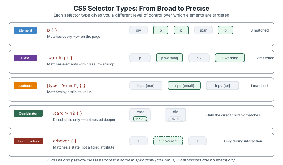
You already know element selectors (p), class selectors (.card), and ID selectors (#main). But CSS has a much wider vocabulary for targeting elements - and using it well means you can style precisely without adding extra classes to your HTML.
Combinators: relationships between elements
Combinators let you select elements based on their position in the DOM tree relative to another element:
/* Direct child only — not deeper descendants */
.card > h2 { font-size: 1.25rem; }

/* Adjacent sibling — the p immediately after an h2 */
h2 + p { margin-top: 0.5rem; }

/* General sibling — any p after an h2, at the same level */
h2 ~ p { color: #52606d; }
The child combinator (>) is especially useful for preventing styles from leaking into nested components. If you style .nav a, every link inside nav is affected - including links inside a dropdown. .nav > a targets only the direct children.
Attribute selectors: matching by data, not appearance
/* Match inputs by type */
input[type="email"] { border-color: #3d85c6; }

/* Match links that open in a new tab */
a[target="_blank"]::after { content: " ↗"; }

/* Match elements whose class starts with "icon-" */
[class^="icon-"] { display: inline-block; }
Attribute selectors are powerful for form styling and for targeting elements without adding extra classes. They score the same as classes in specificity.
Structural pseudo-classes: position in a list
/* First and last items */
li:first-child { font-weight: 700; }
li:last-child { border-bottom: none; }

/* Every other row (striped tables) */
tr:nth-child(even) { background: #f8f9fa; }

/* Only child — useful for conditional layouts */
.card:only-child { max-width: 600px; margin: 0 auto; }
Structural pseudo-classes let you style elements by their position without adding .first or .last classes manually. The browser handles the counting.
State pseudo-classes: interactivity
/* User interaction states */
a:hover { color: #8f2f23; }
a:focus-visible { outline: 2px solid #3d85c6; outline-offset: 2px; }
button:active { transform: scale(0.98); }

/* Form validation states */
input:required { border-left: 3px solid #e67c00; }
input:valid { border-left-color: #2d6a4f; }
State pseudo-classes respond to user behaviour. :focus-visible is especially important - it shows a focus ring for keyboard users but hides it for mouse clicks, giving you the best of both worlds for accessibility.
Pseudo-elements: Visual Detail Without Extra HTML
Pseudo-elements let you insert styled content before or after an element's real content, entirely through CSS. They are ideal for decorative details: underlines, icons, badges, and dividers that do not belong in the HTML because they are presentational, not structural.
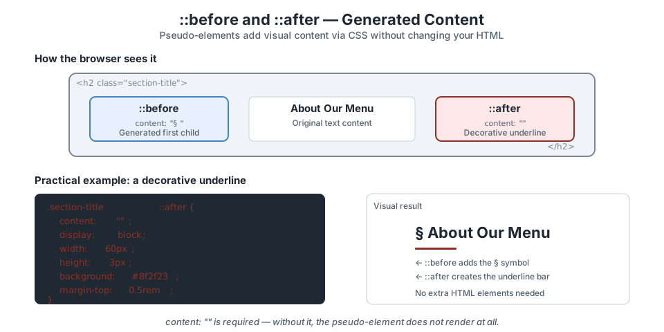
::before and ::after are generated inside the element as its first and last children. The content property is required - without it, nothing renders. The essential rule: content is required
Every ::before and ::after pseudo-element must have a content property. Even if the content is an empty string, the property must be there:
/* This works — empty string creates a styled box */
.heading::after {
  content: "";
  display: block;
  width: 60px;
  height: 3px;
  background: #8f2f23;
}

/* This does NOT work — no content means no element */
.heading::after {
  display: block;
  width: 60px;
  height: 3px;
  background: #8f2f23;
}
Practical pseudo-element patterns
Decorative underline
.section-title::after {
  content: "";
  display: block;
  width: 50px;
  height: 3px;
  background: #8f2f23;
  margin-top: 0.5rem;
}
External link indicator
a[target="_blank"]::after {
  content: " ↗";
  font-size: 0.8em;
  color: #7b8794;
}
Required field marker
label.required::after {
  content: " *";
  color: #8f2f23;
  font-weight: 700;
}
Accessibility note: content generated by pseudo-elements is read by some screen readers but not all. Do not put meaningful text - like instructions or labels - in pseudo-elements. Use them for decoration only.
Transitions: Smooth Property Changes
Without a transition, CSS property changes are instant. One frame the link is blue, the next frame it is red. Transitions add a duration to that change, letting the browser interpolate between the old and new values over time.
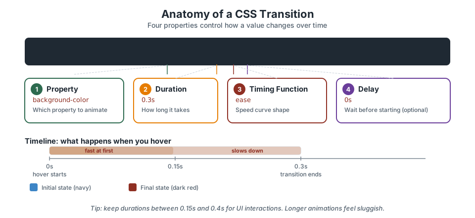
Setting transitions on the base state
Transitions belong on the element's default state, not on the trigger state. This ensures the transition runs in both directions - on hover and on hover-out:
/* ✅ Correct — transition on the base state */
.nav-link {
  color: #1f2933;
  transition: color 0.2s ease;
}
.nav-link:hover {
  color: #8f2f23;
}

/* ❌ Wrong — transition only on :hover means
   the return to default is instant */
.nav-link {
  color: #1f2933;
}
.nav-link:hover {
  color: #8f2f23;
  transition: color 0.2s ease;
}
Choosing what to transition
Be specific about which properties you transition. Using transition: all is tempting but it can cause unexpected animations on properties you did not intend to change - including expensive layout properties:
/* ❌ Transitions everything, including layout properties */
.card { transition: all 0.3s ease; }

/* ✅ Only the properties you want animated */
.card {
  transition: background-color 0.2s ease,
              box-shadow 0.2s ease;
}
Timing functions
The timing function controls the speed curve. For most UI work, you only need two or three:
ease- starts fast, ends slow. Good default for most hover effects.ease-in-out- slow start and slow end. Good for elements entering and leaving visibility.linear- constant speed. Useful for progress bars or loading indicators, but feels mechanical for UI.
Transforms: Visual Changes Without Layout Shifts
Transforms change how an element looks: its position, size, or rotation, without affecting the document flow. The element keeps its original space in the layout, and neighbouring elements do not shift.
This makes transforms ideal for interactive effects. A hover lift, a button press, or a card entrance can use transforms without causing the rest of the page to reflow.
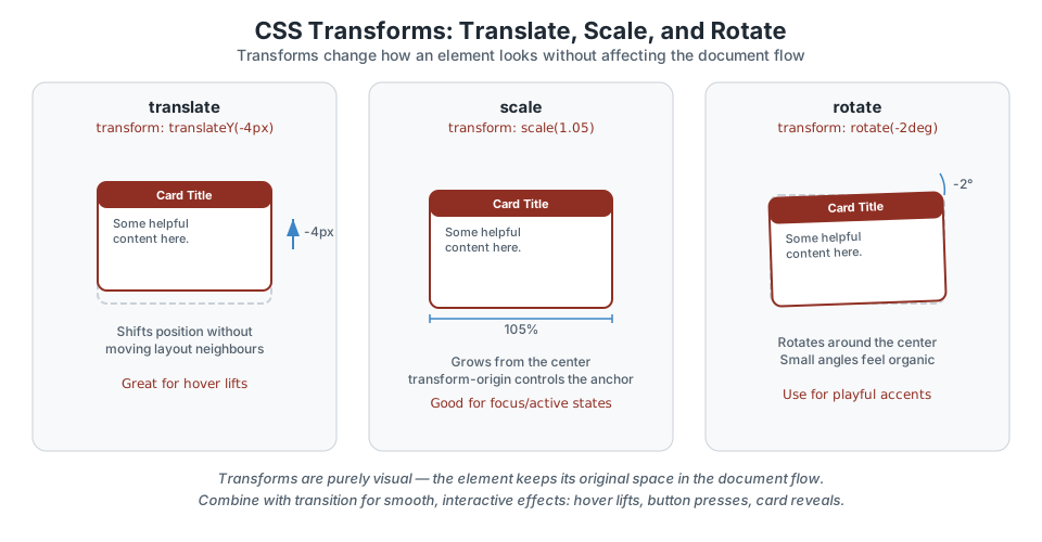
translate: shift position
/* Hover lift — the classic card effect */
.card {
  transition: transform 0.2s ease, box-shadow 0.2s ease;
}
.card:hover {
  transform: translateY(-4px);
  box-shadow: 0 6px 12px rgba(0, 0, 0, 0.1);
}
scale: grow or shrink
/* Button press feedback */
.button:active {
  transform: scale(0.97);
}

/* Subtle image zoom on hover */
.thumbnail:hover {
  transform: scale(1.03);
}
rotate: tilt
/* Playful hover accent on a small icon */
.icon-link:hover .icon {
  transform: rotate(8deg);
}
Combining transforms
You can apply multiple transforms in a single declaration. They are applied right to left:
/* Lift + slight scale on hover */
.card:hover {
  transform: translateY(-4px) scale(1.02);
}
Performance note: transform and opacity are the cheapest properties to animate because the browser can handle them on the GPU compositor layer. Animating width, height, or margin causes layout recalculation and is noticeably slower.
Restrained Motion: When Animation Helps and When It Hurts
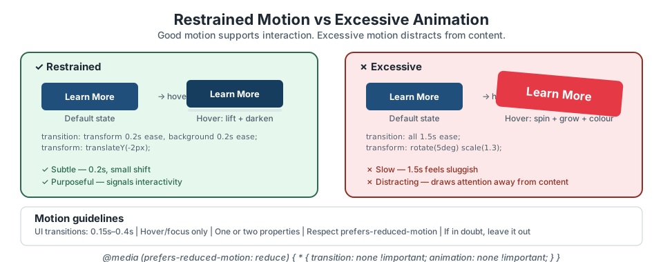
Motion in CSS is a tool, not a feature list. A well-placed transition makes an interface feel responsive. An excessive animation makes it feel chaotic.
Motion Decision Checklist
- Does this motion serve a purpose? It should signal interactivity, provide feedback, or guide attention - not just look cool.
- Is the duration appropriate? UI interactions should feel snappy: 0.15s to 0.4s. Longer than 0.5s feels sluggish.
- Am I animating more than two properties? If so, consider whether all of them need to animate on the same trigger.
- Would a user notice if I removed it? If yes, the motion is serving a purpose. If no, you can probably remove it.
- If in doubt, leave it out. You can always add motion later. Removing it after users have grown used to it is harder.
prefers-reduced-motion: Respecting User Preferences
Some users experience motion sickness, vertigo, or discomfort from screen animations. Operating systems let users signal this preference, and CSS lets you respond to it with a media query:
@media (prefers-reduced-motion: reduce) {
  *,
  *::before,
  *::after {
    transition-duration: 0.01ms !important;
    animation-duration: 0.01ms !important;
    animation-iteration-count: 1 !important;
  }
}
This is a near-instant duration rather than none, which ensures JavaScript-based animation callbacks still fire. Place this at the end of your stylesheet.
You can also be more surgical - keeping subtle colour transitions while removing movement:
@media (prefers-reduced-motion: reduce) {
  .card {
    transition: background-color 0.2s ease;
    /* Remove the lift transform but keep the colour shift */
  }
  .card:hover {
    transform: none;
  }
}
This is not optional. Respecting prefers-reduced-motion is a baseline accessibility requirement, not a nice-to-have. WCAG 2.1 (guideline 2.3) addresses motion that can cause seizures or discomfort.
Pause & Check: Do You Understand?
Before moving forward, can you answer these?
- What is the difference between a pseudo-class (:hover) and a pseudo-element (::before)?
- Why must you always include a content property on ::before and ::after, even if it is empty?
- You write transition: all 0.3s ease on a card. Why might "all" cause unexpected results?
- A button has a hover lift using translateY(-4px). Does the element below it shift up to fill the gap?
Check Your Answers
- A pseudo-class selects an existing element in a particular state (hovered, focused, first-child). A pseudo-element creates a virtual sub-element that you can style - it does not exist in the HTML source.
- The browser only generates the pseudo-element when the content property is present. Without it - even if you set width, height, and background - the pseudo-element does not render at all.
- Transitioning "all" means every property that changes will animate, including layout properties like width and height that may cause jank, or properties you did not intend to animate. Listing specific properties gives you control.
- No. Transforms are purely visual - the element keeps its original space in the document flow. Neighbouring elements are unaffected.
How confident are you with this concept?
Still confused | Getting there | Got it | Could explain it to a friend
Add Polish to a Page
Apply pseudo-elements, transitions, transforms, and a reduced-motion fallback to an existing project page.
Add a decorative pseudo-element
Pick a heading in your project - the Black Swan Bistro site works well. Add a ::after pseudo-element that creates a short decorative underline bar beneath the heading.
- Set
content: ""(empty string) - Set
display: block - Give it a width, height, background colour, and a small margin-top
- Verify in DevTools that the pseudo-element appears inside the heading element in the DOM tree
Need a hint?
Add a hover transition to a link or button
Find a navigation link or button in your project. Add a smooth colour transition on hover:
- Set the
transitionproperty on the default state (not on :hover) - Specify the property name, duration, and timing function
- Add the colour change on the
:hoverpseudo-class - Test it in the browser - it should feel smooth, not instant
Need a hint?
Create a hover lift with transform
Add a subtle lift effect to a card or link component:
- Set
transition: transform 0.2s easeon the default state - On
:hover, addtransform: translateY(-3px) - Optionally add a
box-shadowtransition to pair with the lift - Check that surrounding content does not shift - the transform should be purely visual
Need a hint?
Respect prefers-reduced-motion
Add a media query that disables or reduces your transitions and transforms for users who prefer reduced motion:
- Add
@media (prefers-reduced-motion: reduce) { }at the end of your stylesheet - Inside, set
transition: noneandtransform: noneon the animated elements - Test by enabling "Reduce motion" in your operating system preferences or via DevTools (Rendering tab → Emulate CSS media feature)
Need a hint?
You have finished when:
- A heading has a decorative ::after underline bar
- A link or button transitions colour smoothly on hover
- A card or interactive element has a hover lift using translateY
- A prefers-reduced-motion media query disables or reduces motion
Independent Challenge
Now try this on your own without hints!
Your Task:
Requirements:
- At least one pseudo-element (::before or ::after) adding a decorative detail
- At least one combinator or attribute selector replacing a situation where you might have added a new class
- At least one transition on a hover or focus interaction
- At least one transform (translate, scale, or rotate) paired with a transition
- A prefers-reduced-motion media query that handles all your motion additions
Stretch Goals (Optional):
- Use :nth-child to create alternating styles (striped rows, offset cards)
- Add a focus-visible outline style to all interactive elements for keyboard navigation
- Combine ::before content with an attribute selector to auto-label external links
Success Criteria:
| Criteria | You've succeeded if... |
|---|---|
| Purposeful detail | Every visual addition (pseudo-element, transition, transform) serves a clear UI purpose, not just decoration for its own sake |
| Selector precision | At least one selector uses a combinator or attribute selector to avoid adding a new class to the HTML |
| Restrained motion | Transitions are 0.15s-0.4s, transforms are subtle, and no animation distracts from content |
| Accessibility | prefers-reduced-motion media query is present and handles all animated properties |
Recap
This lesson covered the CSS tools that turn a working layout into a polished page. Combinators and pseudo-classes let you target elements precisely without cluttering your HTML with extra classes. Pseudo-elements add decorative detail through CSS alone - a heading underline, an external-link indicator, a required-field marker - without extra DOM elements.
Transitions smooth out property changes over time. Set them on the base state, be explicit about which properties to transition, and keep durations between 0.15s and 0.4s for UI interactions. Transforms such as translate, scale, and rotate change how an element looks without affecting its space in the document flow, making them ideal for hover lifts, button presses, and subtle reveals.
The hardest skill is restraint. Good motion supports the user's attention. Excessive motion fights it. And prefers-reduced-motion is not a feature - it is a responsibility.
Your Pages Can Feel Considered Now
Key Takeaways:
- Selectors let you target exactly the elements you need - combinators, attribute selectors, and pseudo-classes give precision without adding extra classes to HTML.
- Pseudo-elements (::before, ::after) add visual detail through CSS alone. They always require a content property.
- Transitions animate property changes over time. Set them on the base state, not the trigger state.
- Transforms (translate, scale, rotate) are purely visual - they do not affect document flow or surrounding elements.
- Restrained motion supports user experience. Excessive motion undermines it. When in doubt, leave it out.
- prefers-reduced-motion is not optional. Users who need reduced motion depend on your stylesheet respecting that preference.
Learning Objectives Review:
Look back at what you set out to learn. Can you now:
- Use combinators and pseudo-classes to target elements precisely Check!
- Add decorative detail with ::before and ::after pseudo-elements Got it!
- Write smooth transitions with appropriate duration and timing Can explain it!
- Apply transforms for hover lifts, scale effects, and subtle rotation Could teach this!
- Judge when motion helps and when it hurts usability Check!
- Implement prefers-reduced-motion to respect user accessibility needs Got it!
If you can confidently answer "yes" to most of these, you're ready to move on!
Think & Reflect:
Selector Precision
- Have you used a selector in this lesson that you had not tried before? Which one?
- Can you think of a place in your project where an attribute selector or :nth-child would simplify your CSS?
Visual Polish
- What is one decorative detail you could add to your project with a pseudo-element?
- How do you decide whether a transition duration is too short or too long?
Motion and Accessibility
- Before this lesson, had you heard of prefers-reduced-motion? How does it change your approach to adding animation?
- What is the simplest way to test reduced motion behaviour without changing your OS settings?
Looking Ahead:
Recommended Next Steps
Continue Learning
Ready to move forward? Continue with the next tutorial in this series:
Modern CSS Layout ExtensionsRelated Topics
Explore these related tutorials to expand your knowledge:
Additional Resources
Deepen your understanding with these helpful resources:
- MDN: Pseudo-elements - Reference for practical decorative and structural pseudo-element use cases.
- MDN: Using CSS transitions - A practical guide to restrained motion and transition choices.