CSS Grid for Repeated Layouts
Learn when Grid is the better choice for galleries, card collections, and page regions that need rows and columns together.
Some Layouts Need Rows and Columns
Flexbox is excellent when a layout mainly moves in one direction. But some parts of a website are not just rows or columns. A gallery, menu preview, or collection of cards often needs both at the same time.
This is where CSS Grid becomes useful. Grid lets the parent container describe rows, columns, gaps, and sometimes named page areas, so repeated content can arrange itself more predictably.
The goal is not to use Grid everywhere. The goal is to recognise the layout shape where Grid is the right tool.
- Have you ever tried to make several cards line up by manually setting widths?
- Which parts of a restaurant site might need rows and columns together?
- What becomes easier if the parent layout controls the columns instead of every card managing its own width?
This lesson comes after reusable components because Grid is especially useful once you have repeated cards, gallery items, or page regions that need consistent arrangement.
Learning Objectives
By the end of this lesson, you'll be able to:
- Recognise when a layout problem is two-dimensional
- Use CSS Grid for repeated cards, galleries, and menu previews
- Control columns and spacing from the grid container
- Use repeat(), minmax(), and auto-fit for flexible repeated layouts
- Understand Understand when named grid areas can clarify larger page regions
Why This Matters:
Intermediate layout work is about choosing the tool that matches the content. Grid gives you a clear way to arrange repeated content when rows and columns matter together.
Why Grid Belongs Here
By this point in the builder pathway, you have already worked with sections, reusable CSS patterns, Flexbox, and component-style structures. That matters because Grid works best when you already understand the pieces being arranged.
Use Grid when you need to arrange repeated or area-based content such as:
- gallery tiles
- menu item cards
- feature cards
- product or service listings
- larger page regions with a main area and sidebar
Grid vs Flexbox
The simplest distinction is this: Flexbox is strongest for one main direction. Grid is strongest when rows and columns matter together.
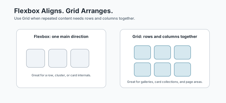
Helpful question: am I aligning a small group in one direction, or arranging repeated content across rows and columns?
Checkpoint for Understanding
Pause here and check whether the Grid mental model is clear before you write grid code.
- What kind of layout problem is Grid especially good at solving?
- Why is Grid usually a better fit than Flexbox for a gallery of repeated cards?
- Predict what happens if you force a two-dimensional card layout into Flexbox and manually manage widths.
Show sample answers
- Grid is strongest when content needs rows and columns together, such as galleries, repeated card collections, or larger page regions.
- Because a gallery usually needs a two-dimensional arrangement where rows and columns work together, not just alignment in one main direction.
- The CSS usually becomes more fragile, because you are fighting the layout shape instead of using a tool designed for rows and columns.
How confident are you with this concept?
Still confused | Getting there | Got it | Could explain it to a friend
Tracks and Gaps
A grid container creates tracks. A column track runs vertically. A row track runs horizontally. The repeated children inside the container become grid items.
.menu-grid {
  display: grid;
  grid-template-columns: 1fr 1fr 1fr;
  gap: 1.5rem;
}
This example creates three equal columns. The gap property controls the spacing between grid items, which is usually cleaner than putting margins on each card.
Build a Repeatable Card Grid
For a repeated card layout, keep the repeated item structure simple and let the parent grid do the arranging.
<section class="section">
  <div class="container">
    <h2 class="section-title">Featured Dishes</h2>

    <div class="menu-grid">
      <article class="menu-card">...</article>
      <article class="menu-card">...</article>
      <article class="menu-card">...</article>
    </div>
  </div>
</section>
The grid does not replace the card component. It arranges the cards. That separation matters: the card owns its internal design, while the grid owns the relationship between repeated cards.
Make Repeated Layouts Flexible
A fixed three-column grid can work on large screens, but it may become cramped on smaller screens. This is where repeat(), auto-fit, and minmax() help.
.menu-grid {
  display: grid;
  grid-template-columns: repeat(auto-fit, minmax(16rem, 1fr));
  gap: 1.5rem;
}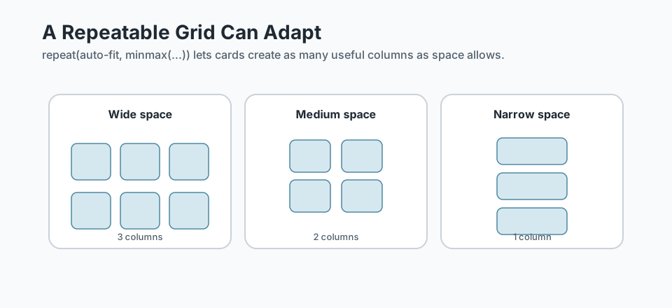
Read the rule in plain English: make as many columns as will fit, but do not let each column get smaller than 16rem. If there is extra room, let the columns stretch evenly.
Use Named Areas for Larger Page Regions
Grid is also useful for larger page regions, especially when you want the CSS to describe the layout shape clearly. Named areas are not required for every grid, but they can make larger arrangements easier to read.
.feature-layout {
  display: grid;
  grid-template-columns: 2fr 1fr;
  grid-template-areas:
    "intro image"
    "details image";
  gap: 2rem;
}

.feature-intro { grid-area: intro; }
.feature-image { grid-area: image; }
.feature-details { grid-area: details; }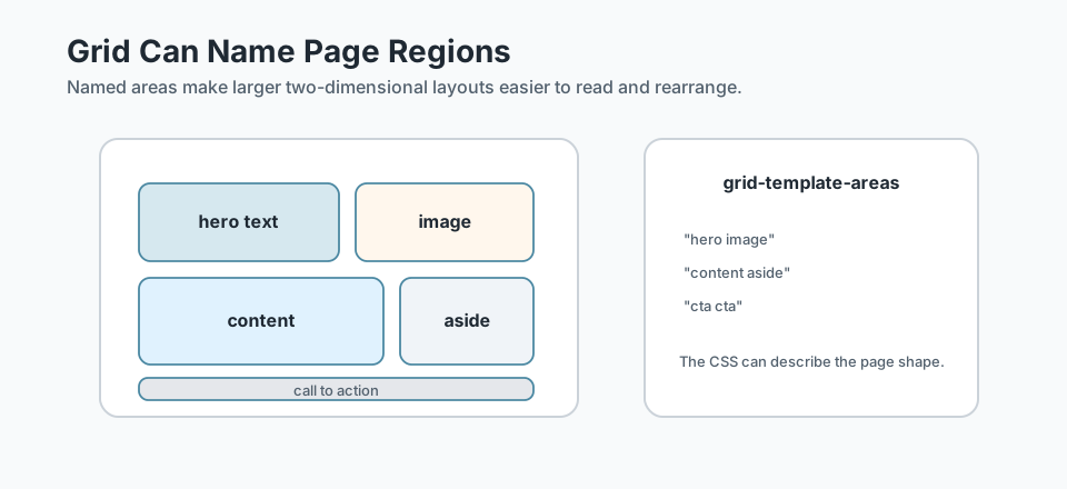
Grid Checklist
Before choosing Grid, run through this quick checklist:
- Does the layout need rows and columns together?
- Is there a parent container that should control the arrangement?
- Are the repeated items structurally similar?
- Would
gapbe cleaner than margins on each item? - Does the layout need to adapt as space changes?
- Would named areas make the layout clearer?
Keep the tool choice honest: if the content only needs to stack naturally, use normal flow. If it only needs one-direction alignment, use Flexbox. Grid earns its place when the layout shape is two-dimensional.
Guided Practice
Build a flexible card grid
Use Grid to arrange repeated cards while keeping the card component itself separate from the layout container.
Step 1: Start with repeated content
Choose a simple repeated pattern such as menu cards, featured dishes, testimonials, or gallery tiles. Write the HTML as a parent wrapper with several repeated child items.
The parent will become the grid container. The repeated items will become grid items.
Need a hint?
Step 2: Create the grid container
Add display: grid to the parent wrapper, then define columns and gap. Start with a simple fixed number of columns before making it responsive.
Need a hint?
Step 3: Make the grid more flexible
Replace the fixed columns with repeat(auto-fit, minmax(...)) so the layout can create as many useful columns as the available space allows.
Need a hint?
You are on track if you can:
- You used one parent grid container with repeated child items
- You used gap to control spacing between repeated items
- You created a grid that can support rows and columns together
- You can explain why Grid fits this layout better than Flexbox
Independent Practice
Independent Practice: Choose a Grid-worthy layout
Now apply Grid to a fresh repeated layout without step-by-step support.
Your Task:
Choose a small repeated layout, such as a gallery, menu preview, feature-card section, or service list. Write the parent grid CSS and enough repeated HTML items to show how the layout works.
Keep the focus on the Grid decision. You are not building a full page.
Requirements:
- Choose a layout where rows and columns genuinely matter
- Create one parent grid container with repeated child items
- Use gap for spacing between items
- Use either fixed columns, repeat(), or auto-fit/minmax() deliberately
- Write one sentence explaining why Grid is the right tool
Stretch Goals (Optional):
- Add a responsive version using repeat(auto-fit, minmax(...))
- Try a named-area layout for a larger section with text and media
Success Criteria:
| Criteria | You've succeeded if... |
|---|---|
| Grid-worthy layout | The learner chooses a repeated or area-based layout where rows and columns genuinely matter. |
| Clean grid container | The parent element controls columns and gaps instead of each item carrying scattered spacing rules. |
| Responsive thinking | The grid has a plan for narrower screens through flexible tracks, media queries, or a clear stacked fallback. |
| Tool choice | The learner can explain why Grid is a better fit than Flexbox or normal flow for this case. |
Recap
CSS Grid gives you a clean way to arrange repeated content when rows and columns matter together. It is especially useful for galleries, card collections, menu previews, and larger page regions. The key is to let the parent grid describe the layout while each repeated item keeps its own internal structure.
Lesson Complete: You Can Use Grid for Repeated Layouts
Key Takeaways:
- CSS Grid is best for layouts where rows and columns matter together.
- The grid container controls the structure; the repeated children become grid items.
- gap, repeat(), minmax(), and auto-fit help repeated layouts stay consistent and flexible.
- Grid is not a replacement for Flexbox. It is a different tool for a different layout shape.
Learning Objectives Review:
Look back at what you set out to learn. Can you now:
- Explain when Grid is a better layout choice than Flexbox Check!
- Create a repeatable card or gallery grid with rows, columns, and gap Got it!
- Use repeat(), minmax(), and auto-fit for flexible repeated layouts Can explain it!
- Recognise when named grid areas can make larger page regions easier to understand Could teach this!
If you can confidently answer "yes" to most of these, you're ready to move on!
Think & Reflect:
Grid Thinking
- Which part of your current project feels most like a true rows-and-columns problem?
- Where have you previously used Flexbox when Grid would have described the layout more clearly?
Responsive Layout
- How does a repeatable grid help the layout adapt without rewriting every card?
- What minimum card width would keep your content readable?
Looking Ahead:
Recommended Next Steps
Continue Learning
Ready to move forward? Continue with the next tutorial in this series:
Responsive Refinement for Reusable ComponentsRelated Topics
Explore these related tutorials to expand your knowledge:
Additional Resources
Deepen your understanding with these helpful resources:
- CSS-Tricks: A Complete Guide to CSS Grid - A practical visual reference for Grid properties, terminology, and layout examples.
- CSS-Tricks: A Complete Guide to Flexbox - Useful for comparing Flexbox’s one-direction strengths with Grid’s two-dimensional layout model.
- MDN: CSS Grid Layout - Reference and guides for using Grid when rows and columns matter together.
- MDN: Basic Concepts of Grid Layout - A clear tutorial on grid containers, tracks, lines, cells, areas, gutters, and flexible tracks.
- MDN: CSS Flexible Box Layout - Canonical Flexbox reference for concepts, properties, and typical one-dimensional layout use cases.
- Every Layout - Helpful for connecting Grid decisions to repeated layout patterns instead of isolated syntax.