Black Swan Bistro - Part 4
Multi-page Site
One Page Is Not a Website Yet.
In Parts 1-3, you built a homepage for the Black Swan Bistro. You structured the HTML, created a wireframe layout, and refactored repeated patterns into reusable components.
That homepage is solid. But a real restaurant site needs more than one page. Visitors expect a dedicated menu, an about page, and a way to get in touch. Part 4 is where the bistro becomes a real multi-page website.
The good news: the reusable components you built in Part 3 - site header, footer, menu cards, and navigation - are about to prove their worth. You will copy those shared structures into new pages and see the benefit of consistent naming and predictable patterns firsthand.
- What parts of the homepage belong on every page of the site?
- What new content does each page need that the homepage does not have?
- How will a visitor know which page they are currently viewing?
This tutorial builds directly on the reusable components and consistent naming from Part 3. Those refactored patterns now become the shared shell for every page.
Learning Objectives
By the end of this lesson, you'll be able to:
- Plan a multi-page site structure: which content is shared, which is page-specific
- Create Create menu, about, and contact pages using the shared header, footer, and navigation
- Link pages together with relative-path navigation that works from every page
- Add an active state to navigation links so visitors know which page they are on
- Organise page-specific CSS alongside shared component styles without conflicts
Why This Matters:
Building a multi-page site with plain HTML and CSS teaches you how websites actually work at the file level. Frameworks automate some of this later, but the underlying concepts - shared structure, relative paths, navigation states - stay the same.
Before You Start:
You should be familiar with:
- Multi-page Structure Review here
- BSB Part 3: Component Refactor Review here
Tutorial Introduction
Until now, the Black Swan Bistro has been a single page. Everything - the hero, the menu preview, the about blurb, the booking CTA - lives in one long index.html.
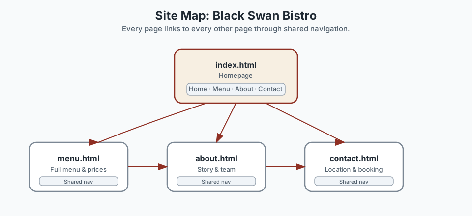
That is normal for an early project. But a real restaurant site needs dedicated pages so visitors can find what they want without scrolling through everything. Part 4 expands the bistro into four distinct pages:
- Home - the existing homepage, trimmed to an overview
- Menu - the full food and drinks menu
- About - the restaurant story and team
- Contact - location, hours, and how to book
Every page shares the same header, navigation, footer, and stylesheet. That means the reusable components from Part 3 do most of the structural work - you just need to add page-specific content in the middle.
Project checkpoint: you should have the Part 3 refactored homepage before beginning this lesson, with named components for the header, navigation, menu cards, CTA blocks, and footer. If your refactor is not complete, go back and finish it first - this lesson depends on those shared patterns.
What You Will Build
After this tutorial, your Black Swan Bistro project will have four working HTML pages linked together with consistent navigation. The visitor will be able to browse between pages, always see the same header and footer, and always know which page they are on thanks to an active navigation state.
Using the Project Brief for Multi-page Structure
Return to the Black Swan Bistro Project Brief before you build the extra pages. Use the brief to ensure consistency between pages and to identify which sections remain the same across the whole site.
The header, footer, navigation, repeated card structures, and heading treatments should stay predictable. The brief helps you separate shared layout patterns from the unique content that belongs only on one page.
How Multi-page Sites Work
A multi-page HTML website is a collection of separate .html files. There is no magic framework gluing them together. The browser loads one file at a time, and links tell it where to go next.
That simplicity is powerful once you understand two ideas:
- Shared structure - the header, navigation, and footer are identical on every page. You copy them into each file so the visitor experiences a consistent site.
- Page-specific content - the middle of each page is unique. The menu page shows dishes. The about page tells the story. The contact page gives directions.
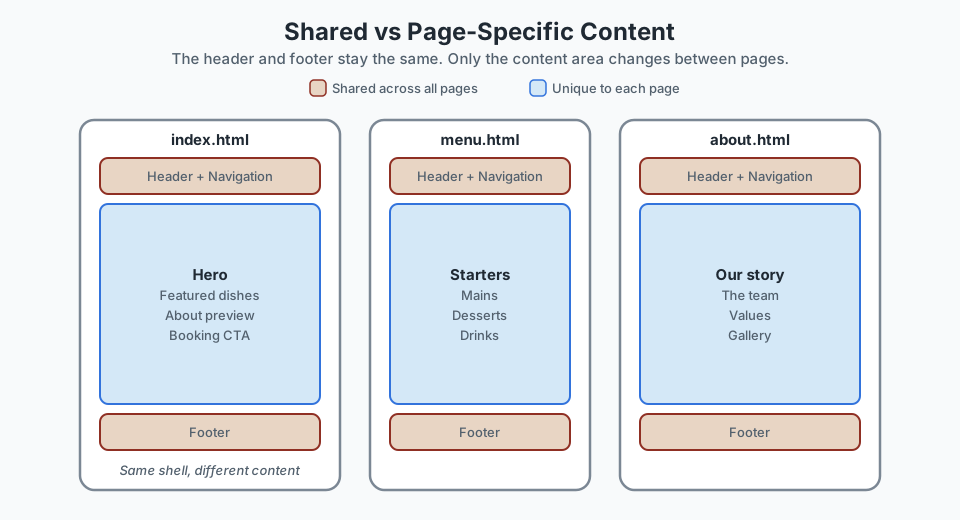
When you work with a framework like Vue or React in the future, it will handle the shared shell automatically. But the underlying concept is the same: a layout wraps page-specific content. Learning to do it by hand first means you will understand what the framework is doing for you.
Step 1: Set Up the New Files
Create three new HTML files at the project root - the same level where index.html already lives. Do not put them inside a subfolder. Keeping all pages at the same level means every page can use the same relative paths to the shared stylesheet and images.
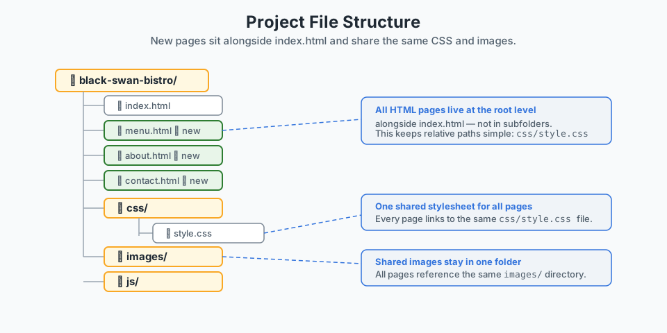
index.html at the project root. They all share the same css/ and images/ folders. # In your terminal, from the project root:
touch menu.html about.html contact.htmlOr in VS Code, right-click the project root in the Explorer panel and choose New File for each one.
Why the root? If menu.html were inside a pages/ subfolder, the path to the stylesheet would need to be ../css/style.css instead of css/style.css. Keeping all pages at the root keeps every relative path identical across the site.
Step 2: Copy the Shared Shell
Every page needs the same document structure: <!DOCTYPE html>, <head> with the stylesheet link, the site header, and the site footer. The easiest way to start is to copy the entire index.html, then delete the homepage-specific content between the header and footer.
What stays:
- The
<!DOCTYPE html>declaration - The
<head>section (including the<link>tocss/style.css) - The
<header class="site-header">block with navigation - The
<footer class="site-footer">block
What changes:
- The
<title>tag - update it for each page - The
<main>content - replace with page-specific sections - The active navigation link - move
is-activeto the current page's link
The Shared Header
This header block should be identical on every page. It uses the .site-header component from Part 3:
<header class="site-header">
  <div class="container site-header__inner">
    <a class="site-logo" href="index.html">Black Swan Bistro</a>

    <nav class="site-nav" aria-label="Main navigation">
      <ul class="site-nav__list">
        <li><a class="site-nav__link" href="index.html">Home</a></li>
        <li><a class="site-nav__link" href="menu.html">Menu</a></li>
        <li><a class="site-nav__link" href="about.html">About</a></li>
        <li><a class="site-nav__link" href="contact.html">Contact</a></li>
      </ul>
    </nav>
  </div>
</header>
Notice the navigation links use simple filenames: menu.html, about.html. Because all pages are at the same directory level, these relative paths work from every page without modification.
The Shared Footer
The footer is the same on all pages too:
<footer class="site-footer">
  <div class="container site-footer__inner">
    <p class="site-footer__brand">Black Swan Bistro</p>

    <ul class="site-footer__links">
      <li><a href="menu.html">Menu</a></li>
      <li><a href="about.html">About</a></li>
      <li><a href="contact.html">Contact</a></li>
    </ul>
  </div>
</footer>
Step 3: Build Each Page
Each page follows the same pattern: shared shell on the outside, unique content in the <main> block. Here is the general template:
<!DOCTYPE html>
<html lang="en">
<head>
  <meta charset="UTF-8">
  <meta name="viewport" content="width=device-width, initial-scale=1.0">
  <title>Page Title — Black Swan Bistro</title>
  <link rel="stylesheet" href="css/style.css">
</head>
<body>
  <!-- Shared header (identical on every page) -->
  <header class="site-header">...</header>

  <!-- Page-specific content -->
  <main>
    <!-- unique sections go here -->
  </main>

  <!-- Shared footer (identical on every page) -->
  <footer class="site-footer">...</footer>
</body>
</html>
The Menu Page
The menu page is the most content-rich new page. It reuses the .menu-card component from Part 3 to show the full food and drinks menu, organised by course.
<main>
  <section class="section">
    <div class="container">
      <h1>Our Menu</h1>
      <p>Seasonal dishes made with local produce, updated regularly.</p>
    </div>
  </section>

  <section class="section">
    <div class="container">
      <h2 class="section-title">Starters</h2>
      <div class="menu-card-grid">
        <article class="menu-card">
          <p class="menu-card__eyebrow">Seasonal</p>
          <h3 class="menu-card__title">Roasted beetroot salad</h3>
          <p class="menu-card__description">
            Roasted beetroot, goat cheese, candied walnuts, balsamic glaze.
          </p>
          <p class="menu-card__price">$18</p>
        </article>

        <article class="menu-card">
          <p class="menu-card__eyebrow">House favourite</p>
          <h3 class="menu-card__title">Crispy squid</h3>
          <p class="menu-card__description">
            Lightly battered squid, aioli, lemon, and fresh herbs.
          </p>
          <p class="menu-card__price">$19</p>
        </article>
      </div>
    </div>
  </section>

  <section class="section">
    <div class="container">
      <h2 class="section-title">Mains</h2>
      <div class="menu-card-grid">
        <article class="menu-card">
          <p class="menu-card__eyebrow">Chef favourite</p>
          <h3 class="menu-card__title">Charred pumpkin risotto</h3>
          <p class="menu-card__description">
            Roasted pumpkin, sage, parmesan, and toasted pepitas.
          </p>
          <p class="menu-card__price">$28</p>
        </article>

        <article class="menu-card">
          <p class="menu-card__eyebrow">Signature</p>
          <h3 class="menu-card__title">Black swan linguine</h3>
          <p class="menu-card__description">
            Squid ink pasta, prawns, chilli, lemon, and herbs.
          </p>
          <p class="menu-card__price">$32</p>
        </article>
      </div>
    </div>
  </section>
</main>
Notice how the menu content uses exactly the same .menu-card structure you defined in Part 3. The component shell stays stable. Only the dish names, descriptions, and prices change.
The About Page
The about page tells the restaurant's story. It does not need cards - it uses simple content sections and possibly an image.
<main>
  <section class="section">
    <div class="container">
      <h1>About Black Swan Bistro</h1>
      <p class="lead">
        A neighbourhood restaurant that believes great food starts
        with honest ingredients and genuine hospitality.
      </p>
    </div>
  </section>

  <section class="section">
    <div class="container">
      <h2 class="section-title">Our Story</h2>
      <p>
        Black Swan Bistro opened its doors in 2019 with a simple idea:
        serve seasonal, locally sourced food in a relaxed dining room.
        We work with farmers and growers from the region to build a menu
        that changes with what is fresh and available.
      </p>
      <p>
        The name comes from the lake behind the original building, where
        black swans gather in the early morning. It felt right for a place
        that values natural, unhurried things.
      </p>
    </div>
  </section>

  <section class="section">
    <div class="container">
      <h2 class="section-title">The Team</h2>
      <p>
        Our kitchen is led by head chef Angela Liu, who trained in Melbourne
        and Lyon before bringing her modern regional style to Black Swan.
        Front of house is run by Sam Torres, who can pair a wine with
        anything on the menu.
      </p>
    </div>
  </section>
</main>
The Contact Page
The contact page gives visitors the practical information they need: where the restaurant is, when it is open, and how to book.
<main>
<section class="section">
<div class="container">
<h1>Contact & Reservations</h1>
<p>We would love to hear from you.</p>
</div>
</section>
<section class="section">
<div class="container info-grid">
<div>
<h2 class="section-title">Location</h2>
<address>
42 Lakeside Drive<br>
Willowbrook, VIC 3150<br>
Australia
</address>
</div>
<div>
<h2 class="section-title">Hours</h2>
<table class="table">
<tr><td>Monday–Tuesday</td><td>Closed</td></tr>
<tr><td>Wednesday–Saturday</td><td>12 pm – 10 pm</td></tr>
<tr><td>Sunday</td><td>12 pm – 4 pm</td></tr>
</table>
</div>
<div>
<h2 class="section-title">Reservations</h2>
<p>
Call us at <a href="tel:+61398765432">(03) 9876 5432</a>
or email
<a href="mailto:hello@blackswanbistro.com.au">hello@blackswanbistro.com.au</a>.
</p>
</div>
</div>
</section>
</main>Step 4: Mark the Active Navigation Link
When a visitor arrives on the menu page, they should immediately see that "Menu" is the active link. This is a small usability detail that makes a big difference - it tells the visitor where they are in the site without them having to think about it.
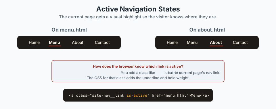
is-active on its own link. The CSS does the rest. Add a class called is-active to the current page's navigation link. On menu.html, the Menu link gets the class:
<!-- In menu.html -->
<a class="site-nav__link is-active" href="menu.html">Menu</a>
On about.html, the About link gets it instead:
<!-- In about.html -->
<a class="site-nav__link is-active" href="about.html">About</a>
Then add CSS for the active state in your stylesheet. This rule already fits inside the .site-nav component section from Part 3:
.site-nav__link.is-active {
  font-weight: 700;
  border-bottom: 3px solid var(--color-red, #8f2f23);
}
One active link per page. Make sure only the current page's link carries is-active. If you copy-pasted the nav from another page, double-check that you moved the class to the correct link.
Step 5: Organise Page-Specific CSS
Most of your CSS is shared - the component styles, layout helpers, and foundations apply to every page. But some pages may need a few unique rules. The contact page, for example, might use an .info-grid layout that the menu page does not need.
You have two good options for handling page-specific styles:
Option A: One Stylesheet, Organised Sections
Keep everything in css/style.css and add a clearly labelled section for page-specific rules at the bottom:
/* ─── Page-specific: Contact ─── */
.info-grid {
  display: grid;
  grid-template-columns: repeat(auto-fit, minmax(260px, 1fr));
  gap: 2rem;
}

/* ─── Page-specific: About ─── */
.lead {
  font-size: 1.25rem;
  line-height: 1.7;
  color: var(--color-ink, #1f1b18);
  max-width: 640px;
}
This is the simplest option and works well for a site with four or five pages.
Option B: Separate Page Stylesheets
If page-specific CSS grows, you can create separate files and link them in the page's <head> after the shared stylesheet:
<link rel="stylesheet" href="css/style.css">
<link rel="stylesheet" href="css/contact.css">
This keeps the shared styles untouched and isolates page-specific rules. Either approach is fine - pick whichever feels more manageable for your project.
Pause & Check: Do You Understand?
Before moving forward, can you answer these?
- Why do all four HTML pages link to the same css/style.css file?
- Why should new page files sit at the project root alongside index.html, instead of inside a subfolder?
- What does the is-active class do and why does it change between pages?
Check Your Answers
- A single shared stylesheet means you only write and maintain one set of component styles. When you update a colour variable or fix a card layout, the change applies to every page at once.
- Keeping all pages at the same directory level means every page can use the same relative paths to shared assets: css/style.css and images/. Nesting pages inside subfolders would break those paths or require different ones per page.
- The is-active class visually marks which page the visitor is currently on by adding a bold weight, underline, or colour change. Each page sets the class on its own nav link so the visitor always sees where they are in the site.
How confident are you with this concept?
Still confused | Getting there | Got it | Could explain it to a friend
Build the Multi-page Bistro Site
Follow these steps to expand your Black Swan Bistro from a single homepage into a working four-page website.
Copy the shared shell into menu.html
Open index.html and copy the entire <header> and <footer> blocks into a new file called menu.html. Keep the same <!DOCTYPE html>, <head>, and stylesheet link.
Tip: copy the full document, then delete the homepage content between header and footer. That gives you a clean shell to fill.
Need a hint?
Add menu content sections
Between the header and footer, add the menu content using the .menu-card component from Part 3:
<main>
  <section class="section">
    <div class="container">
      <h1>Our Menu</h1>
      <p>Seasonal dishes made with local produce.</p>
    </div>
  </section>

  <section class="section">
    <div class="container">
      <h2 class="section-title">Starters</h2>
      <div class="menu-card-grid">
        <!-- menu-card components here -->
      </div>
    </div>
  </section>
</main>
Need a hint?
Set the active navigation link
In menu.html, find the Menu link inside the .site-nav and add the is-active class:
<a class="site-nav__link is-active" href="menu.html">Menu</a>Then open index.html and add is-active to the Home link instead.
Need a hint?
Repeat for about.html and contact.html
Create about.html and contact.html using the same process:
- Copy the shell (header + footer + head section) from any existing page
- Replace the
<main>content with page-specific material - Move the
is-activeclass to the correct nav link - Update the
<title>tag
Need a hint?
Test all navigation links
Open index.html in your browser and click every navigation link. Verify:
- Each link opens the correct page
- The active link highlights correctly on every page
- The header and footer look identical on every page
- The stylesheet loads on every page (check that colours and spacing appear)
Need a hint?
You have finished when:
- Four HTML files exist at the project root: index.html, menu.html, about.html, contact.html
- Every page has the same header and footer
- Navigation links work between all four pages
- The active link is correct on each page
- The shared stylesheet loads and applies styles on every page
- Each page has a unique title tag
Independent Challenge
Now try this on your own without hints!
Your Task:
Requirements:
- Add a Drinks course section to menu.html using the same .menu-card-grid and .menu-card structure
- Add a Gallery section to about.html with at least 3 placeholder images inside a simple grid
- Make sure the new sections use the same .section and .container layout wrappers as the existing content
- Check that the page renders correctly and the layout is consistent
Stretch Goals (Optional):
- Add a Desserts course section to the menu page
- Create a simple contact form placeholder on the contact page using HTML form elements
- Add a skip-to-content link at the top of each page for keyboard users
Success Criteria:
| Criteria | You've succeeded if... |
|---|---|
| Component reuse | New sections use existing .menu-card and .section patterns without inventing new class names |
| Layout consistency | New sections feel like a natural extension of the existing page layout |
| Code organisation | Any new CSS is clearly separated from shared component styles |
Recap
You started this series with a client brief and a blank HTML file. You have now turned that brief into a working multi-page website, built entirely from reusable components you defined yourself.
In Part 4, you expanded the Black Swan Bistro from a single homepage into a four-page website. You learned that a multi-page HTML site is a collection of separate files sharing the same header, footer, stylesheet, and navigation.
The component refactoring from Part 3 made this expansion straightforward. Because the header, footer, and menu cards already had consistent names and stable structures, copying them into new pages was a reliable process rather than a messy one.
You also added active navigation states so visitors always know which page they are on - a small detail that makes the site feel intentional and complete.
The main limitation of this approach is manual repetition: every time you change the header or footer, you need to update it in four files. That is the natural motivation for templating systems and frameworks, which you will encounter later. For now, the important thing is that you understand the structure beneath those tools.
Part 4 Complete: Your Bistro Is a Real Website
Key Takeaways:
- A multi-page site reuses the same header, footer, navigation, and stylesheet across every page.
- Each page is a separate HTML file at the project root, sharing relative paths to CSS and images.
- The is-active class on navigation links tells the visitor which page they are viewing.
- Page-specific CSS keeps unique layout rules from cluttering the shared stylesheet.
- Good component structure from Part 3 made this expansion straightforward - reusable patterns paid off immediately.
Learning Objectives Review:
Look back at what you set out to learn. Can you now:
- Plan a multi-page site structure with shared and page-specific regions Check!
- Create menu, about, and contact pages that reuse the shared header and footer Got it!
- Link pages together with working relative-path navigation Can explain it!
- Mark the current page with an active navigation state Could teach this!
- Add page-specific CSS without disrupting shared component styles Check!
If you can confidently answer "yes" to most of these, you're ready to move on!
Think & Reflect:
Site Structure
- Which part of the shared shell was easiest to reuse across pages?
- Where did you need to change something slightly between pages, and how did you decide what to keep consistent?
Navigation Thinking
- How does active navigation help a visitor who lands on a page from a search engine?
- What would happen to the user experience if the navigation links were in a different order on each page?
Looking Ahead
- What repetitive work would disappear if you could use a templating system or a framework in a future version?
- What has the plain-HTML approach taught you about site structure that a framework alone would not?
Looking Ahead:
Recommended Next Steps
Continue Learning
Ready to move forward? Continue with the next tutorial in this series:
BSB Part 4B: Polish and RefineRelated Topics
Explore these related tutorials to expand your knowledge:
Additional Resources
Deepen your understanding with these helpful resources:
- MDN: Creating hyperlinks - How to create effective links between pages.
- MDN: Document and website structure - Helpful background for planning page regions and shared site structure across multiple pages.
- web.dev: Learn HTML — Navigation - Practical guidance on navigation patterns, breadcrumbs, and global vs local navigation.