Black Swan Bistro - Part 3
Refactor Repeated Patterns into Components
The Page Works. Now Make It Reusable.
In Part 2, you built a wireframe layout for the Black Swan Bistro homepage. You created repeated visual patterns: cards, buttons, navigation links, section spacing, and footer content.
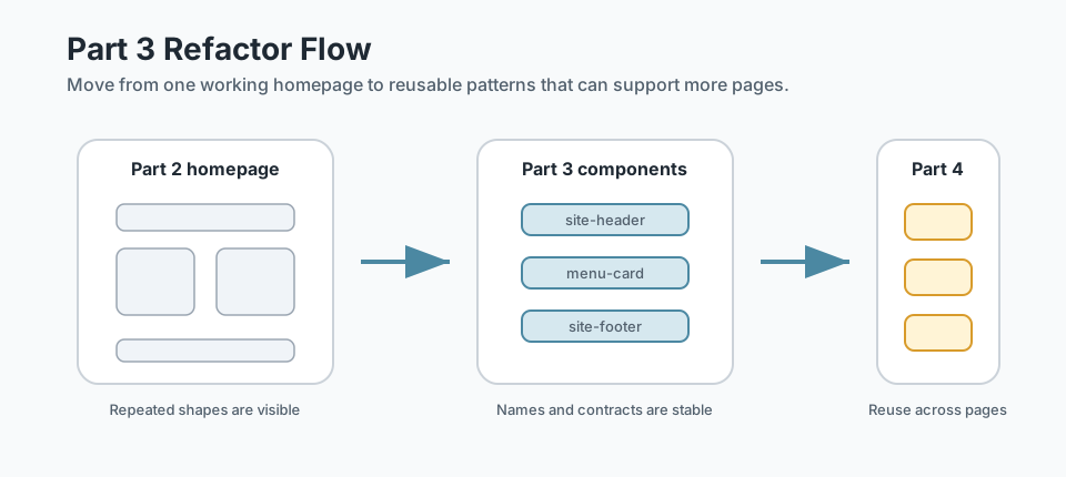
That is a good place to be. The page has enough structure that you can now see what repeats. Part 3 is where you stop treating those repeated pieces as one-off HTML and start treating them as reusable components.
We are still using plain HTML and CSS. No framework. No build magic. Just better structure, clearer names, and patterns that can survive the next stage of the project.
- Which parts of your homepage repeat the same shape or role?
- Which repeated pieces will probably appear again on the menu, about, or contact page?
- What would become easier if those pieces had one reliable structure?
This project part applies the systems, Flexbox, and reusable component thinking from the previous bridge lessons. It prepares the bistro site for Part 4, where shared patterns need to work across multiple pages.
Learning Objectives
By the end of this lesson, you'll be able to:
- Review the BSB homepage and identify repeated UI patterns
- Refactor navigation, cards, CTA blocks, and footer content into reusable structures
- Separate component CSS from page-specific layout CSS
- Use purpose-based class names that describe what a pattern does
- Check component accessibility basics before reusing patterns across pages
Why This Matters:
A component is not a framework feature. It is a repeatable design decision. Learning to build components with plain HTML and CSS gives you the mental model you need before any future framework can be useful.
Before You Start:
You should be familiar with:
- Building Reusable Components Review here
- BSB Part 2: Homepage Wireframe Review here
Tutorial Introduction
This part is a refactor lesson. You are not starting the bistro site again. You are taking the Part 2 homepage and making its repeated structures more consistent, easier to reuse, and easier to extend.
That matters because the next major project step is multi-page structure. If every card, footer link, and call-to-action is slightly different before you create more pages, those small differences multiply quickly. A calm refactor now saves mess later.
Project checkpoint: you should have the Part 2 homepage wireframe before beginning this lesson. If your page is not polished yet, that is fine. This lesson is about structure and reuse, not final visual design.
Keep the client brief close: the components you are about to build - navigation, cards, calls to action, footer - come directly from the content and structure described in the Black Swan Bistro client brief. If you are unsure what belongs inside a component, the brief tells you what the restaurant needs and who it is for.
What You Will Build
By the end of this lesson, your bistro homepage should still look familiar, but the code underneath it should be cleaner. You will create reusable structures for:
- the site header and navigation
- menu and featured-dish cards
- call-to-action sections
- the site footer
- shared component CSS that can be used again in Part 4
Refer back to the Project Brief
Open the Black Swan Bistro Project Brief again before you refactor. Look at the wireframes and identify which elements repeat across pages.
Those repeated areas become your reusable components. Header patterns, menu cards, footer groups, CTA sections, and repeated headings are all easier to recognise when you compare the homepage to the menu, about, and contact layouts in the brief.
What Component Refactoring Means Here
In this lesson, a component means a repeatable HTML pattern with CSS that supports it. It is not a Vue component, React component, or custom element. Those tools can come later. First, you need the underlying thinking.
A useful component has three parts:
- a stable outer wrapper, such as
.menu-card - named internal parts, such as
.menu-card__titleand.menu-card__meta - flexible content that can change without changing the component structure
Step 1: Create a Pattern Inventory
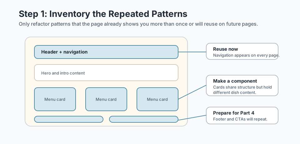
Before writing new code, scan your Part 2 homepage and list the repeated patterns. This prevents you from inventing components too early. You only refactor what the page has already shown you it needs.
Pattern Inventory
| Pattern | Where it appears | Component decision |
|---|---|---|
| Navigation links | Header, later every page | Make reusable now |
| Menu cards | Featured dishes, menu preview | Make reusable now |
| CTA blocks | Hero, booking section | Make reusable lightly |
| Footer links | Footer, later every page | Make reusable now |
| Gallery items | Homepage gallery | Keep simple until Grid lesson |
Step 2: Define Component Contracts
A component contract is a small agreement with yourself: this pattern has a name, these are its internal parts, and this is the kind of content it expects. The contract keeps the component predictable when you reuse it later.
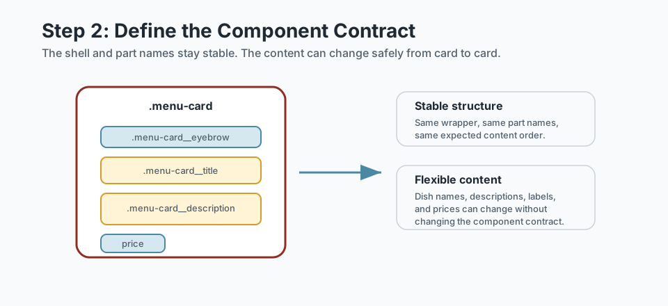
For example, a menu card might use this contract:
<article class="menu-card">
  <p class="menu-card__eyebrow">Chef favourite</p>
  <h3 class="menu-card__title">Charred pumpkin risotto</h3>
  <p class="menu-card__description">
    Roasted pumpkin, sage, parmesan, and toasted pepitas.
  </p>
  <p class="menu-card__price">$28</p>
</article>
The exact food changes. The structure does not. That is the point.
Step-by-Step Refactor
Now move through the homepage one pattern at a time. Keep the changes small. A good refactor should make the code clearer without changing everything at once.
1. Refactor the Navigation
The navigation is one of the most important reusable structures because it will appear on every page in Part 4. Start by making the header structure consistent.
<header class="site-header">
  <div class="container site-header__inner">
    <a class="site-logo" href="index.html">Black Swan Bistro</a>

    <nav class="site-nav" aria-label="Main navigation">
      <ul class="site-nav__list">
        <li><a class="site-nav__link" href="index.html">Home</a></li>
        <li><a class="site-nav__link" href="menu.html">Menu</a></li>
        <li><a class="site-nav__link" href="about.html">About</a></li>
        <li><a class="site-nav__link" href="contact.html">Contact</a></li>
      </ul>
    </nav>
  </div>
</header>
Notice the class names. They describe the pattern itself, not where it happens to sit on the homepage. That makes the same structure easier to reuse on future pages.
2. Refactor Menu and Featured-Dish Cards
In Part 2, you may have used a broad class like .card. That is useful for early layout, but now the bistro has a more specific repeated pattern: .menu-card.
<div class="menu-card-grid">
  <article class="menu-card">
    <p class="menu-card__eyebrow">Seasonal</p>
    <h3 class="menu-card__title">Southwest gnocchi</h3>
    <p class="menu-card__description">
      Potato gnocchi, roasted capsicum, basil oil, and parmesan.
    </p>
    <p class="menu-card__price">$26</p>
  </article>

  <article class="menu-card">
    <p class="menu-card__eyebrow">Signature</p>
    <h3 class="menu-card__title">Black swan linguine</h3>
    <p class="menu-card__description">
      Squid ink pasta, prawns, chilli, lemon, and herbs.
    </p>
    <p class="menu-card__price">$32</p>
  </article>
</div>
The grid arranges the cards. The card component owns the internal structure. Keep those jobs separate.
3. Refactor Call-to-Action Blocks
CTA blocks usually combine a heading, a short explanation, and a link. They may look different depending on where they appear, but the structure is often similar.
<section class="section cta-block">
  <div class="container cta-block__inner">
    <div>
      <p class="eyebrow">Bookings</p>
      <h2 class="cta-block__title">Reserve a table for this weekend</h2>
      <p class="cta-block__text">
        Join us for local produce, thoughtful wine, and a relaxed dining room.
      </p>
    </div>

    <a class="button" href="contact.html">Book now</a>
  </div>
</section>
You do not need to turn every section into a complex component. This is a light component: consistent enough to reuse, simple enough to understand.
4. Refactor the Footer
The footer is another shared site pattern. It should not be rebuilt differently on each page later. Give it the same treatment as the header: a stable wrapper, internal layout, and named parts.
<footer class="site-footer">
  <div class="container site-footer__inner">
    <p class="site-footer__brand">Black Swan Bistro</p>

    <ul class="site-footer__links">
      <li><a href="menu.html">Menu</a></li>
      <li><a href="about.html">About</a></li>
      <li><a href="contact.html">Contact</a></li>
    </ul>
  </div>
</footer>
Organise the Component CSS
Component refactoring is not only about HTML. Your CSS should also show the difference between global foundations, layout helpers, and components.
/* 1. Foundations */
:root {
  --color-cream: #f7efe2;
  --color-ink: #1f1b18;
  --color-red: #8f2f23;
  --space-4: 1rem;
  --space-6: 1.5rem;
}

/* 2. Layout helpers */
.container { width: min(1100px, 92%); margin: 0 auto; }
.section { padding: 3rem 0; }

/* 3. Components */
.site-header { border-bottom: 3px solid var(--color-red); }
.site-header__inner {
  display: flex;
  justify-content: space-between;
  align-items: center;
  gap: var(--space-4);
  flex-wrap: wrap;
}

.menu-card {
  display: grid;
  gap: 0.75rem;
  padding: var(--space-6);
  background: white;
  border: 1px solid rgba(31, 27, 24, 0.18);
}
Avoid accidental components: a class like .homepage-red-box describes a location and a visual detail. A class like .cta-block describes a reusable purpose.
Component Accessibility Check
Reusable code can spread good decisions or bad decisions. Before you reuse these patterns in Part 4, check the basics:
- Navigation uses a real
<nav>element with an accessible label. - Navigation links are real links, not clickable
<div>elements. - Headings stay in a sensible order inside cards and sections.
- Interactive links and buttons have visible hover and focus states.
- Card content still makes sense if the CSS does not load.
Prepare the Site for Part 4
Part 4 expands the bistro into a multi-page site. Before moving on, your homepage should have a small set of shared patterns ready to copy into the next pages.
Before You Move On
- Your header and footer use purpose-based class names.
- Your menu cards share one consistent HTML structure.
- Your CTA block can be reused without changing its core CSS.
- Your component CSS is grouped separately from global reset and layout helpers.
- You can explain what content changes inside each component and what structure stays stable.
Short Recap
In Part 3, you turned visible repetition into reusable structure. The goal was not to make Black Swan Bistro more complicated. It was to make the code more honest about what the page already contains: repeated navigation, repeated cards, repeated calls to action, and repeated footer content.
That gives the project a stronger foundation. When you add more pages, you will not be inventing the header, footer, and card structure from scratch each time.
Student Reflection Questions
- Which repeated pattern was easiest to refactor into a component?
- Which component needs the clearest internal class names to stay readable?
- Where did separating layout CSS from component CSS make the code easier to understand?
- What should stay the same when a component is reused on another page?
Lesson Complete: Your Bistro Patterns Are Reusable
Key Takeaways:
- Components are reusable HTML and CSS patterns, not just visual decorations.
- A strong component has a stable outer structure and clear internal parts.
- Navigation, menu cards, CTA blocks, and footer patterns should become predictable before the site becomes multi-page.
- Good component refactoring makes Part 4 easier because shared page sections already have names, structure, and behaviour.
Learning Objectives Review:
Look back at what you set out to learn. Can you now:
- Identify repeated patterns from the BSB Part 2 homepage wireframe Check!
- Define small component contracts for navigation, cards, CTA blocks, and footer content Got it!
- Refactor repeated HTML into consistent class names and reusable structures Can explain it!
- Organise component CSS so layout rules and component rules do not blur together Could teach this!
- Prepare the bistro site for multi-page reuse in Part 4 Check!
If you can confidently answer "yes" to most of these, you're ready to move on!
Think & Reflect:
Pattern Recognition
- Which repeated pattern became easier to understand after you gave it a clear component name?
- Where did you decide not to make something a component yet, and why?
Preparing for More Pages
- Which component will save the most work when the menu, about, and contact pages arrive?
- What class names now describe purpose instead of page position?
Looking Ahead:
Recommended Next Steps
Continue Learning
Ready to move forward? Continue with the next tutorial in this series:
Black Swan Bistro — Part 4 (Multi-page Site)Related Topics
Explore these related tutorials to expand your knowledge:
Additional Resources
Deepen your understanding with these helpful resources:
- BEM — Block Element Modifier - A useful naming model for component shells and internal parts.
- CSS-Tricks: A Complete Guide to Flexbox - Helpful when aligning navigation, footer links, and component interiors.
- MDN: Document and website structure - A useful refresher for keeping reusable HTML patterns semantic.