How to Read a Design
Learn to extract spacing, colours, typography, and structure from a mockup.
Design Files Are Full of Clues
A mockup is not just a pretty picture. It is a set of decisions waiting to be translated into code.
When you know what to look for, you can read a design the way a builder reads a plan: spacing, alignment, hierarchy, repeated blocks, states, and assets all start to reveal themselves.
You do not need to copy every pixel by instinct. You need to learn how to collect the right clues in the right order.
- When you open a design, do you usually feel clear about what to look for first?
- Have you ever missed a repeated pattern because you focused only on the page as a whole?
- What details in a mockup tend to confuse you most?
In the builder path, reading the design well comes before coding the layout well. This lesson helps you build that habit.
Learning Objectives
By the end of this lesson, you'll be able to:
- Read a design in a structured order instead of randomly inspecting details
- Notice spacing, alignment, typography, and colour clues that affect implementation
- Spot repeated visual patterns that will matter later for reuse
- Create Create coding notes that make the HTML and CSS stages more deliberate
Why This Matters:
Design-to-code work becomes much easier once you stop asking "what should I copy first?" and start asking "what information does this design give me about structure, hierarchy, and repetition?"
Step 1: Take a First Pass
Do not zoom into the smallest details immediately. Start by asking broad questions.
- How many major sections are on the page?
- What is the main message in the hero area?
- Where does the eye go first, second, and third?
- Which areas feel repeated?
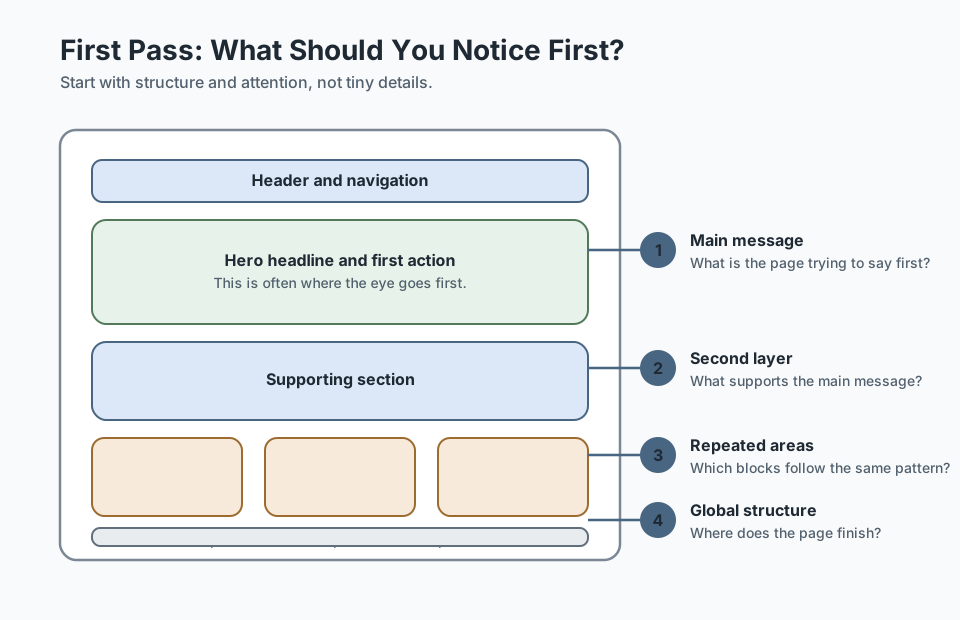
This first pass helps you understand the page as a whole before you start pulling it apart.
Step 2: Read Spacing and Structure
Spacing is one of the most important design clues because it tells you which things belong together and which things should feel separate.
- Look at the gaps between sections.
- Look at the gaps inside cards or content blocks.
- Look for consistent left and right edges.
- Look for repeated width patterns, such as centered containers.
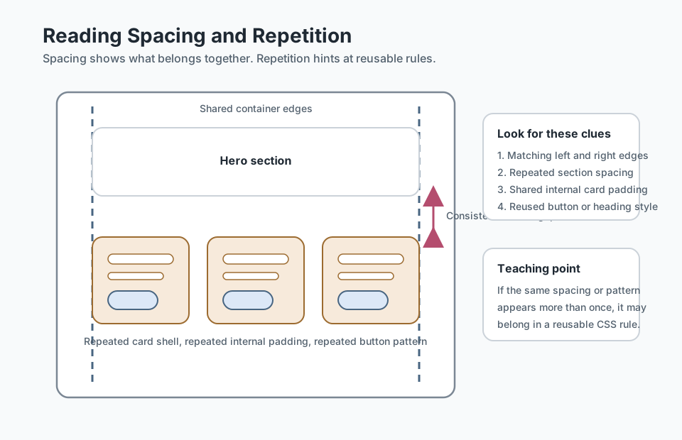
Useful habit: if two things share the same spacing pattern more than once, write it down as a reusable rule instead of treating it as a one-off decision.
Checkpoint for Understanding
Pause here and check whether you are reading the design as a system of clues rather than as decoration.
- Why should you read spacing and structure before trying to copy exact colours or pixel values?
- What is one sign that a visual pattern in a design may become shared CSS later?
- Predict what happens if you open a mockup and jump straight into coding without collecting notes first.
Show sample answers
- Because spacing and structure reveal how the page is organised, which repeated parts belong together, and which rules might need to become reusable in code.
- If the same card shell, button style, section heading, or spacing pattern appears more than once, it is probably a candidate for reuse.
- You are more likely to miss repeated patterns, make inconsistent spacing decisions, and treat reusable parts as separate one-off styling problems.
How confident are you with this concept?
Still confused | Getting there | Got it | Could explain it to a friend
Step 3: Read Colour and Typography
You do not need a perfect style guide to start noticing design rules.
- Which colours are used for actions like buttons and links?
- Which colours are used for headings, body text, and backgrounds?
- How many heading sizes are visible?
- Is there a consistent text rhythm from large heading to smaller body copy?
This helps you move toward reusable colour variables and heading patterns later.
Step 4: Spot Repeated Patterns
This is where design reading starts to connect directly to better code.
- Do multiple sections use the same kind of card?
- Do buttons share the same shape and colour?
- Do section headings follow the same visual rule?
- Do image blocks repeat a similar size or framing style?
Repeated patterns may begin as shared CSS classes. Later, they may grow into reusable components.
Step 5: Check States and Assets
A design file often contains more than static layout. It may also hint at hover states, active links, icons, logos, and images that the final build will need.
- Are there obvious buttons or links that need hover states?
- Is there a logo that should influence the project colour system?
- Are some images real content and others only placeholders?
- Will the layout depend on icons, profile photos, or gallery images?
Step 6: Make a Simple Notes Checklist
Before coding, write down practical notes. They do not need to be elegant. They need to be useful.
Design notes

- 6 main sections
- centered page container
- repeated card pattern in 2 places
- one main button style
- warm neutral background
- strong hero headline
- gallery needs grid layout
- footer is simple link cluster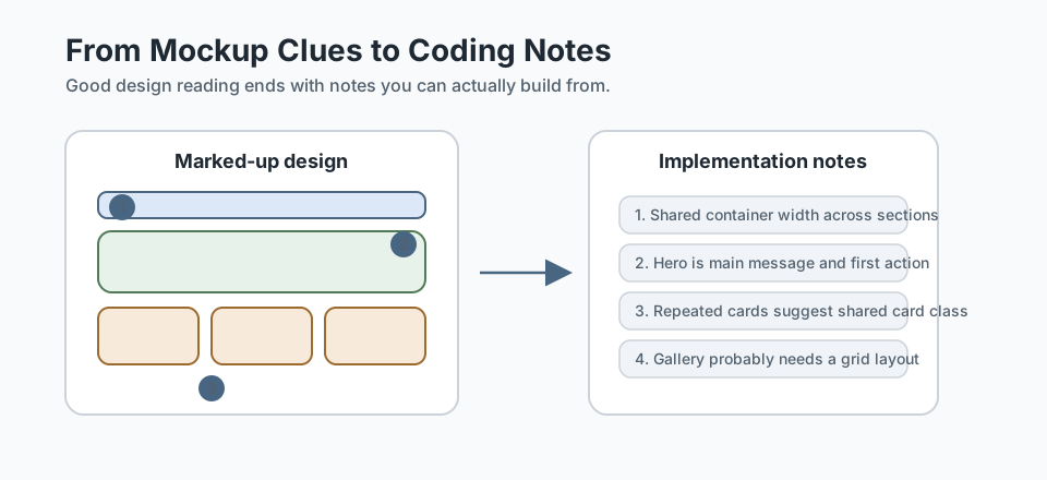
These notes are the bridge between the visual design and your implementation plan.
Guided Practice
Read one design like a builder
Use a structured process to turn a visual design into notes you could actually build from.
Step 1: Take a structured first pass
Open a homepage mockup, landing page screenshot, or reference site. Spend a minute identifying the main message, the biggest sections, and the areas that repeat.
Do not measure anything yet. Focus on what the page is trying to communicate and how it is grouped.
Need a hint?
Step 2: Read spacing, type, and pattern clues
Now inspect the design more closely. Look for repeated container widths, section gaps, heading sizes, button treatments, and card shells.
Your goal is to move from "this looks nice" to "these are the rules I can see."
Need a hint?
Step 3: Turn the mockup into implementation notes
Write a short design-to-code note list that captures structure, spacing, repeated patterns, states, and needed assets.
Keep the notes practical enough that they would help you or another learner start building the page.
Need a hint?
You are on track if you can:
- You captured the main message and major sections before smaller details
- You identified repeated spacing, pattern, or typography clues
- You turned the mockup into short implementation notes
- You can explain how the notes would make coding easier
Independent Practice
Independent Practice: Read a fresh mockup
Now apply the same process to a different design without step-by-step support.
Your Task:
Choose a different homepage, hero section, or small landing page design. Create your own short reading notes that cover structure, spacing, repeated patterns, typography clues, and any important states or assets.
Keep the notes practical enough that they would help you start building the page later.
Requirements:
- Identify the major sections and main message first
- Note at least two repeated patterns or reusable clues
- Capture one typography or colour rule you can see
- Write notes that would help guide later HTML or CSS work
Stretch Goals (Optional):
- Compare two designs and note how their repeated patterns differ
- Identify one part of the design that would likely become a reusable component later
Success Criteria:
| Criteria | You've succeeded if... |
|---|---|
| Reading order | The learner starts with structure and hierarchy before focusing on polish. |
| Pattern recognition | The notes identify repeated blocks, shared spacing, or visual rules that could support reuse later. |
| Implementation usefulness | The notes are practical enough to guide HTML and CSS decisions. |
| Transfer | The learner can apply the same reading method to a fresh design, not just the example from the lesson. |
Additional Resources
These readings are especially useful if you want to get better at reading homepage purpose, repeated patterns, and design systems:
- Nielsen Norman Group: Homepage Design Principles - strong for understanding hierarchy, scanning, and what users expect from a homepage.
- Every Layout - helpful for recognising repeated layout patterns beneath the visual surface of a mockup.
Recap
Reading a design well means collecting useful clues in a sensible order. Start big, then move inward: sections, spacing, hierarchy, colour, patterns, states, and assets. Once you do that, the code stops feeling like guesswork.
Lesson Complete: You Can Read Designs More Deliberately
Key Takeaways:
- Reading a design is a practical skill, not a mysterious creative gift.
- Start with structure and spacing before worrying about exact visual polish.
- Look for repeated patterns, visual rules, and clues about content hierarchy.
- Your goal is to turn a mockup into useful notes that make coding easier.
Learning Objectives Review:
Look back at what you set out to learn. Can you now:
- Inspect a design in a deliberate order instead of guessing Check!
- Extract spacing, hierarchy, colour, and pattern clues from a mockup Got it!
- Spot repeated blocks that may become reusable styles or components later Can explain it!
- Create simple implementation notes before you write code Could teach this!
If you can confidently answer "yes" to most of these, you're ready to move on!
Think & Reflect:
Observation
- Which design detail do you usually notice first: colour, spacing, text, or structure?
- What did you miss before you started reading the design more systematically?
Preparation
- How would your code change if you captured better notes before you started?
- Which repeated patterns in a design are worth writing down immediately?
Looking Ahead:
Recommended Next Steps
Continue Learning
Ready to move forward? Continue with the next tutorial in this series:
Breaking Layouts into SectionsRelated Topics
Explore these related tutorials to expand your knowledge:
Additional Resources
Deepen your understanding with these helpful resources:
- NN/g: Homepage Design Principles - Helpful for understanding homepage hierarchy, scanning, and user expectations.
- Every Layout - Useful for noticing reusable layout relationships beneath a visual mockup.