Modern CSS Architecture
Build stylesheets that can grow without turning every future change into an override.
The 500-line stylesheet moment
You start with one tidy CSS file. A few weeks later, the homepage styles affect the menu page, the button has five slightly different versions, and nobody wants to touch the hero section because something always breaks.
That is not a failure of CSS. It is a sign that the stylesheet needs architecture.
- Where would you currently add a new card style?
- How would you know whether an old selector is still safe to change?
- Which repeated values are already hiding in your CSS?
You will give your CSS a map: tokens, layers, components, utilities, and page-specific rules.
Learning Objectives
By the end of this lesson, you'll be able to:
- Explain why CSS architecture matters once a site has more than a few pages
- Organise CSS into logical responsibility layers
- Separate layout rules from component styling
- Apply design tokens with CSS custom properties
- Choose a naming strategy that makes selectors predictable
- Reduce specificity conflicts without relying on !important
- Build maintainable stylesheets that can grow over time
Why This Matters:
CSS architecture keeps your site flexible. It helps you reuse patterns, reduce accidental side effects, and make design changes without hunting through a pile of unrelated selectors.
Before You Start:
You should be familiar with:
- Cascade, specificity, and debugging CSS Review here
- CSS systems for reusable sections Review here
- Container queries for reusable components Review here
Why Architecture Matters
A small website can survive with a single stylesheet and a few familiar selectors. A growing website needs stronger habits. Without them, CSS starts to behave like a shared drawer: everything is technically in one place, but finding the right thing becomes harder every week.
Good CSS architecture answers practical questions before they become bugs:
- Where do site-wide defaults live?
- Where do repeated design decisions live?
- Which rules control layout, and which rules style components?
- How do we add a variant without breaking older pages?
- How do we override something without raising specificity again?
The goal is not to invent a complex system. The goal is to make the next honest change easier than the last one.
Principle 1: Design Systems First
Design tokens are named values for repeated decisions. In plain CSS, they are usually custom properties. Instead of scattering the same color or spacing value through many selectors, you give that decision a name.
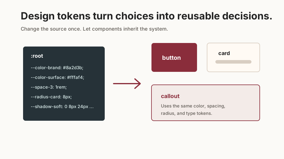
A hard-coded stylesheet tends to repeat decisions like this:
.card {
  padding: 24px;
  border-radius: 12px;
  background: #fffaf4;
  color: #232323;
}

.callout {
  padding: 24px;
  border-radius: 12px;
  background: #fffaf4;
  color: #232323;
}
A token-based version keeps the decision in one place:
:root {
  --color-text: #232323;
  --color-surface: #fffaf4;
  --space-card: 1.5rem;
  --radius-card: 0.75rem;
}

.card,
.callout {
  padding: var(--space-card);
  border-radius: var(--radius-card);
  background: var(--color-surface);
  color: var(--color-text);
}
Tokens should describe meaning. --color-brand is more useful than --dark-red if the color might change later. The name should tell you why the value exists.
Principle 2: Organise CSS Into Responsibility Layers
Responsibility layers are the mental model for your stylesheet. They work whether your project has one CSS file, several imported files, or component-scoped CSS.
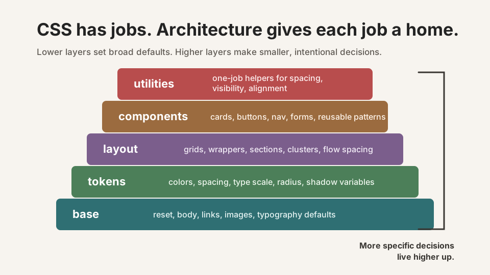
| Layer | Owns | Example |
|---|---|---|
| Tokens | Named design decisions | --space-section, --color-brand |
| Base | Element defaults | body, img, a |
| Layout | Page structure and placement | .wrapper, .grid, .stack |
| Components | Reusable interface pieces | .card, .site-nav, .button |
| Utilities | Small single-purpose adjustments | .visually-hidden, .text-center |
| Pages | Rare page-specific compositions | .menu-page, .about-intro |
Principle 3: Use Cascade Layers for Predictable Order
CSS cascade layers let you declare the order of major stylesheet categories. That means a low-specificity utility in a later layer can intentionally beat a component rule in an earlier layer without adding selector weight.
@layer reset, tokens, base, layout, components, utilities;

@import url("./reset.css") layer(reset);
@import url("./tokens.css") layer(tokens);
@import url("./base.css") layer(base);
@import url("./layout.css") layer(layout);
@import url("./components.css") layer(components);
@import url("./utilities.css") layer(utilities);
You can also keep layers in one stylesheet while learning:
@layer components {
  .testimonial-card {
    padding: var(--space-card);
    border-radius: var(--radius-card);
  }
}

@layer utilities {
  .text-center {
    text-align: center;
  }
}
Pause and Check: Do the layers make sense?
Before moving into selectors and naming, check your architecture map.
- Why should layout and component rules usually live apart?
- Why are custom properties useful for design tokens?
- What problem do cascade layers solve?
Tips to Remember:
- If a selector describes page placement, it probably belongs in layout.
- If a selector describes a reusable interface object, it probably belongs in components.
- If a class does exactly one small job, it may belong in utilities.
Show sample answers
- Layout controls where a thing sits in the page. Component CSS controls what that reusable thing looks like internally. Mixing them makes the component harder to reuse.
- They give repeated design decisions a single named source, so future changes can happen intentionally instead of through many hard-coded values.
- They make category order explicit, reducing the need for heavier selectors just to win the cascade.
How confident are you with this concept?
Still confused | Getting there | Got it | Could explain it to a friend
Principle 4: Prefer Components Over Page-Specific CSS
Page-specific CSS is sometimes necessary, but it should be the exception. If the same pattern appears on the homepage, menu page, and contact page, it deserves a component name.
Prefer this:
.testimonial-card {
  display: grid;
  gap: var(--space-3);
  padding: var(--space-card);
  border: 1px solid var(--color-border);
}
Over this:
.home-page .reviews .box {
  display: grid;
  gap: 1rem;
  padding: 1.5rem;
  border: 1px solid #ddd;
}
The first selector names a reusable object. The second selector names a location. Location-based selectors are fragile because they stop making sense when the content moves.
Principle 5: Keep Specificity Low
Specificity is not bad. Unplanned specificity is the problem. Long descendant chains feel helpful at first because they target exactly what you can see, but they become expensive when you need to reuse or override the style.
/* Expensive to override */
.home-page main .feature-section article.card a.button {
  color: white;
}

/* Easier to reason about */
.button--primary {
  color: white;
}
Modern CSS also gives you tools such as :where(), which has zero specificity. It is useful for broad grouping selectors that should stay easy to override.
:where(.content) h2 {
  margin-block-start: var(--space-section);
}
Treat !important as a last resort. If you need it often, the stylesheet is telling you that order, naming, or specificity needs repair.
Principle 6: Use Utilities for Small, Honest Jobs
Utility classes are single-purpose helpers. They are useful when a small adjustment should not become a whole new component variant.
.visually-hidden {
  position: absolute;
  width: 1px;
  height: 1px;
  overflow: hidden;
  clip: rect(0 0 0 0);
  white-space: nowrap;
}

.text-center {
  text-align: center;
}
Utilities are best when the job is obvious and limited. A utility should not become a hiding place for complex design decisions that really belong in tokens or components.
Principle 7: Choose a Naming Strategy
Naming is architecture in miniature. A selector name should make it clear whether you are styling a component, a child element, a variant, a layout primitive, or a utility.
| Strategy | Useful Idea | Example |
|---|---|---|
| BEM | Block, element, modifier naming | .card__title, .card--featured |
| CUBE CSS | Composition, utility, block, exception | Separate layout composition from reusable blocks |
| ITCSS | Layer styles from broad to specific | Settings, tools, generic, elements, objects, components |
| Utility-first | Use small single-purpose classes heavily | Good for controlled systems, noisy if used without rules |
You do not need to copy a methodology perfectly. Choose the parts that answer your project's real problem. For GraphitEdge-style learning sites, a practical blend works well: tokens, low-specificity components, reusable layout primitives, and a small utility layer.
Principle 8: Separate Layout from Components
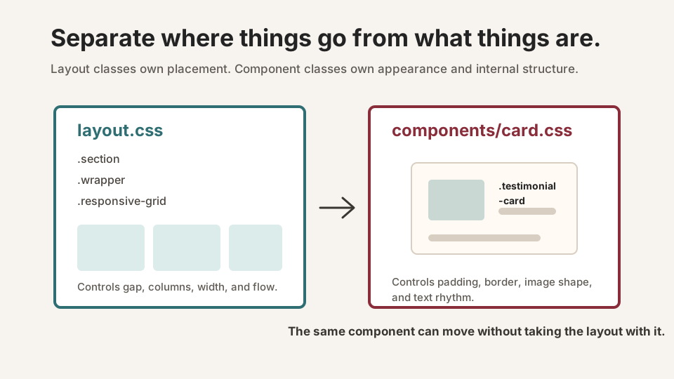
A common beginner mistake is putting grid rules directly on a component because the component currently appears inside a grid. That couples the component to one page layout.
/* Layout primitive */
.responsive-grid {
  display: grid;
  gap: var(--space-4);
  grid-template-columns: repeat(auto-fit, minmax(min(18rem, 100%), 1fr));
}

/* Reusable component */
.testimonial-card {
  display: grid;
  gap: var(--space-3);
  padding: var(--space-card);
  border-radius: var(--radius-card);
  background: var(--color-surface);
}
Example Project Structure
Your exact file names can change, but the responsibilities should remain visible.
src/
  assets/
    styles/
      main.css
      tokens.css
      base.css
      layout.css
      components/
        button.css
        card.css
        navigation.css
      utilities.css
      pages/
        menu.css
        contact.css
If your project uses Vue single-file components, you may keep some component CSS inside the component file. The same principle still applies: global design tokens and layout primitives stay global, while component internals stay close to the component.
Refactoring Workflow: From Messy to Maintainable
- Find repeated values and create tokens for the meaningful ones.
- Separate element defaults from layout classes.
- Rename repeated page patterns as components.
- Replace long selector chains with direct component or variant classes.
- Add utilities only for small, repeated, single-purpose adjustments.
- Check one real page after each move so you catch visual changes early.
Refactor in passes. Trying to perfect the whole stylesheet in one move creates too much risk. A calm architecture grows through small, visible improvements.
Guided Practice
Refactor a growing stylesheet
Take a mixed stylesheet and give it a clear architecture without changing the visual design.
Inventory the existing stylesheet
Read the stylesheet once without editing. Mark rules as base, layout, component, utility, or page-specific. Anything you cannot label is a signal that the selector may be doing too much.
Need a hint?
Move repeated values into tokens
Create a :root block for repeated colors, spacing values, radii, and shadows. Replace hard-coded duplicates with var() references where the meaning is stable.
Need a hint?
Create the architecture layers
Split the stylesheet into a clear order: tokens, base, layout, components, utilities, and pages. If you are staying in one file for the exercise, use comments or @layer blocks to make the same structure visible.
Need a hint?
Lower specificity on purpose
Replace long chains such as .home .section .card .button with a component class, a variant class, or a low-specificity wrapper using :where() where appropriate.
Need a hint?
Your refactor is working if:
- Every rule has a clear home
- Repeated design decisions are stored as custom properties
- Layout selectors do not style component internals
- Component selectors can move to a different page without being renamed
- No new !important declarations are needed
Independent Practice
Independent Practice: Architect the Black Swan Bistro CSS
Now apply the same decisions to a realistic small-business website.
Your Task:
Imagine the Black Swan Bistro site has grown from one homepage into a multi-page website. Refactor the stylesheet into clear CSS responsibilities: base, layout, components, utilities, and page-specific rules.
Do not redesign the site. Your job is to make the existing design easier to maintain.
Requirements:
- Create a token list for brand colors, surface colors, spacing, border radius, and type scale
- Identify at least three reusable components such as cards, buttons, navigation, or menu item previews
- Separate layout primitives from component internals
- Replace at least two location-based selectors with reusable component selectors
- Write a short note explaining where you would avoid !important and why
Stretch Goals (Optional):
- Add cascade layer names for each responsibility group
- Create one utility class and explain why it should not be a component variant
- Document one future design change that would now be easier
Success Criteria:
| Criteria | You've succeeded if... |
|---|---|
| Structure | The stylesheet is organised into base, layout, component, utility, and page-specific responsibilities. |
| Tokens | Repeated colors, spacing, border radii, and type decisions use meaningful custom properties. |
| Reuse | Cards, buttons, navigation, and callouts can be reused without depending on a single page context. |
| Specificity | Selectors stay short and predictable, and overrides do not require !important. |
Recap
Modern CSS architecture is not about making CSS look impressive. It is about making the stylesheet understandable after the easy stage is over. You now have a practical structure for deciding where rules belong: tokens for repeated decisions, base for defaults, layout for placement, components for reusable interface pieces, utilities for small jobs, and page files for rare local needs.
Lesson Complete: You Can Give CSS a System
Key Takeaways:
- CSS architecture is about assigning responsibilities before the stylesheet becomes tangled.
- Design tokens turn repeated visual choices into named decisions.
- Cascade layers give broad categories of CSS a predictable order.
- Layout classes should place things; component classes should describe reusable interface pieces.
- Low specificity keeps future changes cheaper.
Learning Objectives Review:
Look back at what you set out to learn. Can you now:
- Explain why CSS architecture matters Check!
- Organise CSS into logical responsibility layers Got it!
- Separate layout and component styling Can explain it!
- Use custom properties as design tokens Could teach this!
- Choose a naming strategy for predictable selectors Check!
- Avoid specificity wars and unnecessary !important declarations Got it!
If you can confidently answer "yes" to most of these, you're ready to move on!
Think & Reflect:
Architecture Check
- Which part of your current CSS is easiest to change?
- Which part feels most likely to break when you add a new page?
- What naming or layering rule would remove the most uncertainty?
Next Refactor
Choose one existing stylesheet and refactor only one category first. Tokens or components are usually the best starting point because they reveal repeated decisions quickly.
Real-World Test:
When a client asks for a new page, a new card variation, or a brand color update, architecture decides whether that change feels routine or risky. Your stylesheet should help you make the next change with confidence.
Looking Ahead:
Next, practise applying this architecture to debugging and production workflows. Look for places where clear CSS responsibilities make problems easier to isolate.
Recommended Next Steps
Continue Learning
Ready to move forward? Continue with the next tutorial in this series:
Test and Validate Your SiteRelated Topics
Explore these related tutorials to expand your knowledge:
Additional Resources
Deepen your understanding with these helpful resources:
- Modern CSS Architecture worksheet - GraphitEdge download being built.
- Black Swan Bistro stylesheet refactor checklist - GraphitEdge download being built.
- MDN: Cascade layers
- MDN: Cascade and inheritance
- MDN: Using CSS custom properties
- BEM naming guide
- CUBE CSS